Perfecting the Pickup
In 2012, tapping a button to Uber across the city felt magical. By the start of 2016, this magic receded to a slew of disparate features that made the experience slow and complex to use.
I was part of an ambitious project to redesign the Uber pickup experience for the fastest growing startup in history.
To comply with my non-disclosure agreement, I have omitted and obfuscated confidential information in this case study. All information in this case study is my own and does not necessarily reflect the views of Uber.
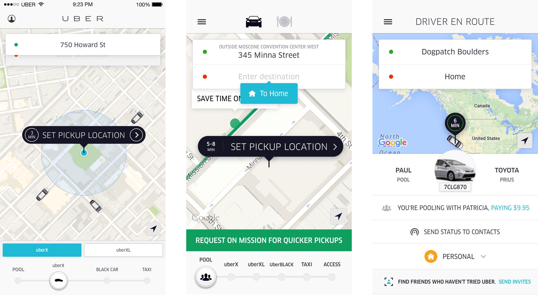
Design by accretion
In just five years since 2011, Uber transformed from a black car service for 100 friends in San Francisco to a global transportation network. By 2016, Uber delivered over 3 million rides a day in over 400 cities across 70 countries.
The Rider app — designed in 2012, struggled to scale alongside the hyper-growth of the company. Fundamental usability was challenged. Disparate features and experiments competed for focus. App reliability and performance issues increased exponentially.
The Rider app had become the org chart.
The Challenge
Recapture the Magic in 10 Months
Our goal for the project was to recapture the magic of the early days of Uber. The original premise was simple: tap a button, get a ride. However, we weren't trying to revert to a simple past. Our ambitions were to create a strong foundation that embraced a rapidly evolving business and more diverse user base.
Our high level goals were to:
- Make it fast and easy to use for everyone, everywhere.
- Give riders more control over their time and money.
- Create a platform for innovation and deeper engagement.
My Role
I led the design of the pickup experience between October 2015 and June 2016 and collaborated with two other designers on the Home screen, Search and On Trip features.
In addition, I worked alongside a Researcher, Prototyper, Content Strategist and 2 Product Managers.
I stopped working on the project during the detailed visual design phase as the app started to be built.
The app launched globally on November 2nd, 2016.
Kickoff
Picking up the pieces
At the outset of the project we didn’t have a clear mission or specific goals for the pickup experience. Without pre-existing insights, I partnered with our researcher Shruti to explore how Riders were getting around.
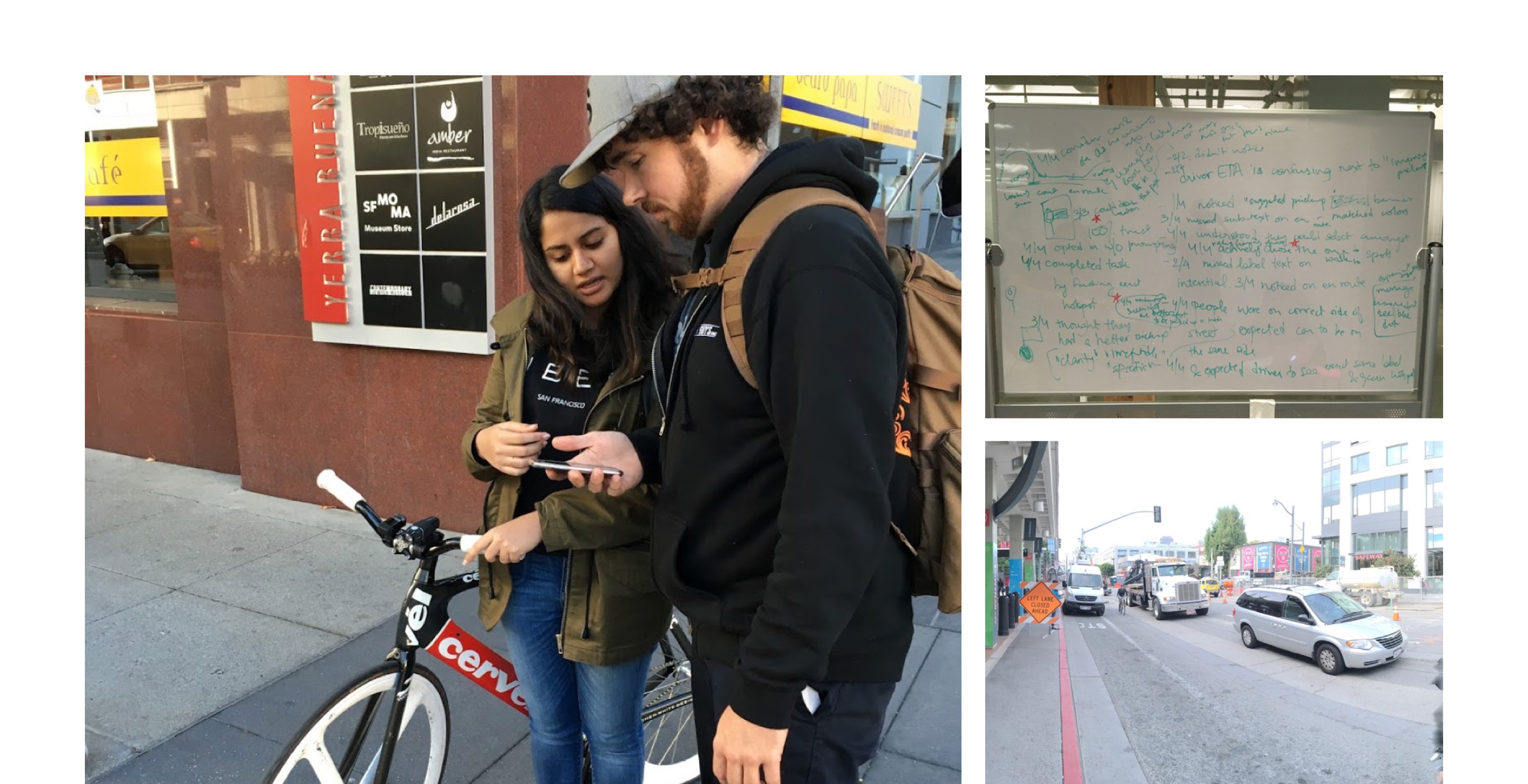
Early Insights from the Field
We tested the existing Uber app with 8 participants in the most problematic pickup areas in San Francisco. Our goals were to understand the challenges Riders and Drivers faced and the workarounds they employed.
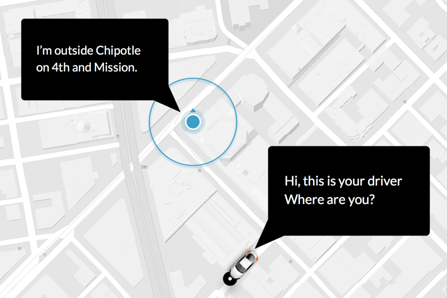
Frequent contact to confirm or coordinate location
Riders were annoyed when they were contacted by their Driver to confirm the location. Riders expected Uber to do the work and didn't feel the need to reiterate.
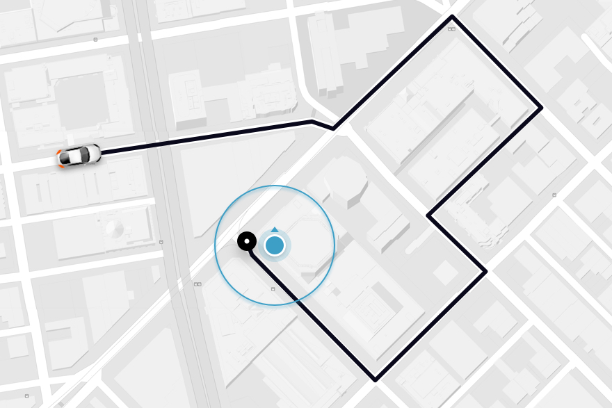
Suboptimal routes given to Driver
Riders were frustrated with the specific routes that the Driver used in getting to their pickup location. Riders expected Uber routing to be smarter.
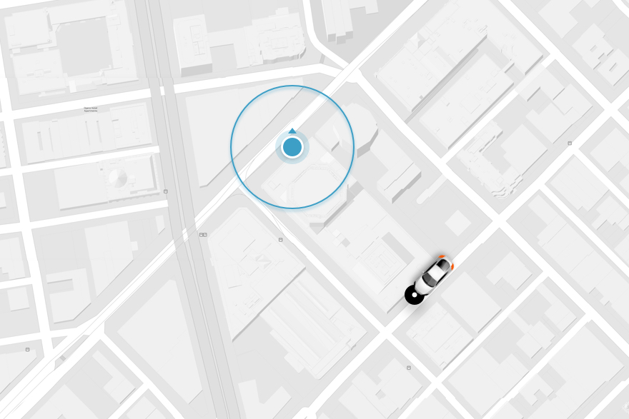
Unexpected arrival location
Often, Drivers did not arrive where the Rider expected. Riders would need to cross the road, backtrack on the block or negotiate an alternative pickup location.
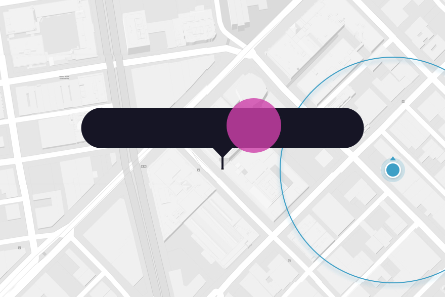
Pin setters and button mashers
Riders behave in two distinct ways. Those who explicitly set a pickup location (via search or pin) and those that expected the Driver to arrive at their current location.
The Discovery
Rider Expectations Changed Over Time
I was surprised by the issues we found. They felt like privileged San Francisco annoyances, rather than major problems faced by our global audience. But after some thinking, it became clearer that Riders expected the experience to just work with minimal effort. As Uber became more integral to their lives, their expectations evolved.
“Curiosity revealed an opportunity to perfect the pickup experience for everyone, everywhere.”
If power users with great reception, powerful phones and tech literacy were having trouble in our most mature marketplace, how bad was the pickup experience in our immature marketplaces with more challenging technological and environmental contexts? Curiosity revealed an opportunity to perfect the pickup experience for everyone, everywhere. This was the beginnings of a working north star.
Deeper Insights
Working backwards from Perfect
Before I could jump into designing, it was important to define success and understand the health of the pickup experience at scale.
Prior to the redesign, contact rate i.e the rate at which a phone call occurs during the pickup was the only proxy we had used to measure pickup quality.
I unpacked the concept of the perfect pickup and modeled for the dimensions of time, space and anxiety.
I partnered with our data scientist and used this framework to investigate the pickup health around the world.

Most pickups require additional physical or coordination effort
Digging into the data revealed some big insights into the pickup experience. Almost all trips involved some extra coordination effort such as a phone call to clarify the location and additional physical effort such as walking somewhere else to meet the driver, or the driver re-circling the block. This data showed that the experience was hardly the door-to-door magic Uber had been optimized for.
“In a city as busy as San Francisco, over $1 million was wasted per week because of problematic pickups.”
The time and energy spent recovering during problematic pickup situations was having a material impact on the business bottom line. Waiting time translates directly into network under-utilization and every phone call costs to anonymize.
In a city like San Francisco, over $1 million was wasted per week because of problematic pickups. Cities like Guangzhou and New Delhi were much worse.
I have intentionally omitted confidential data here.
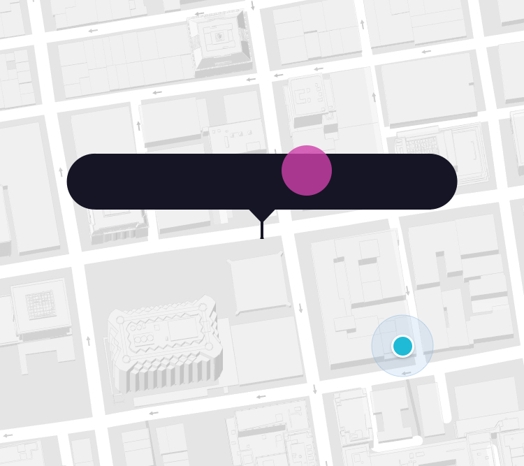
No pickup specified
A large majority of Riders don’t explicitly set their pickup location. They rely on the default device location of the app. Half of all sessions are at least 100m inaccurate.
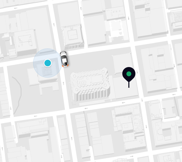
Requested location is often not the pickup
Only a small percentage of trips start within 20m of requested location. Where the Driver is sent and where the Rider is actually picked up is mismatched.
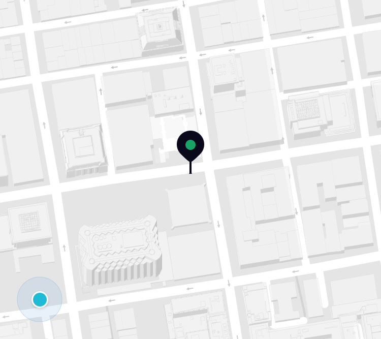
GPS updates ignored
A large number of sessions have an improved GPS accuracy by the time of request. Many of these sessions improve over 1000m in accuracy.
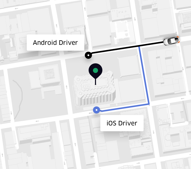
Some pickups just don’t make sense
Many trips are requested from within buildings. This can result in different pickup locations, depending on the operating system of the Driver.
Reframing the Problem
Poorly formed rendezvous plans cause downstream pickup problems
The Rider app exacerbates the formation of problematic pickup plans between Riders and Drivers. Problematic pickup plans consist of inaccurate locations, ambiguous information and inefficient routes which causes confusion. Ancillary communication and additional physical effort is required from Riders and Drivers to recover, which leads to frustration and wasted time.
“...how might we help Riders and Drivers form a better pickup plan?”
This begged the question, how might we help Riders and Drivers form a better pickup plan? Our proposal was Rendezvous, a pickup plan created on behalf of Riders and Drivers.
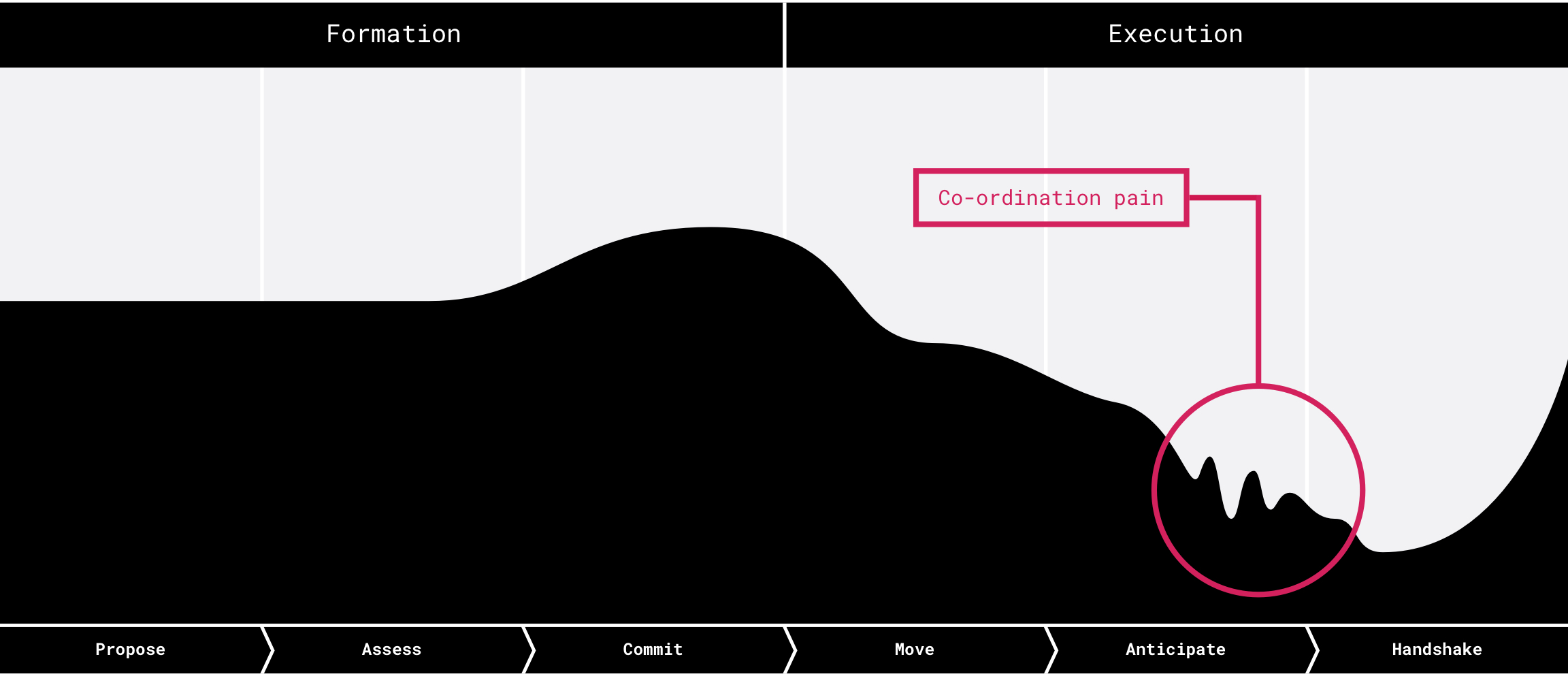
The Pickup Redesign
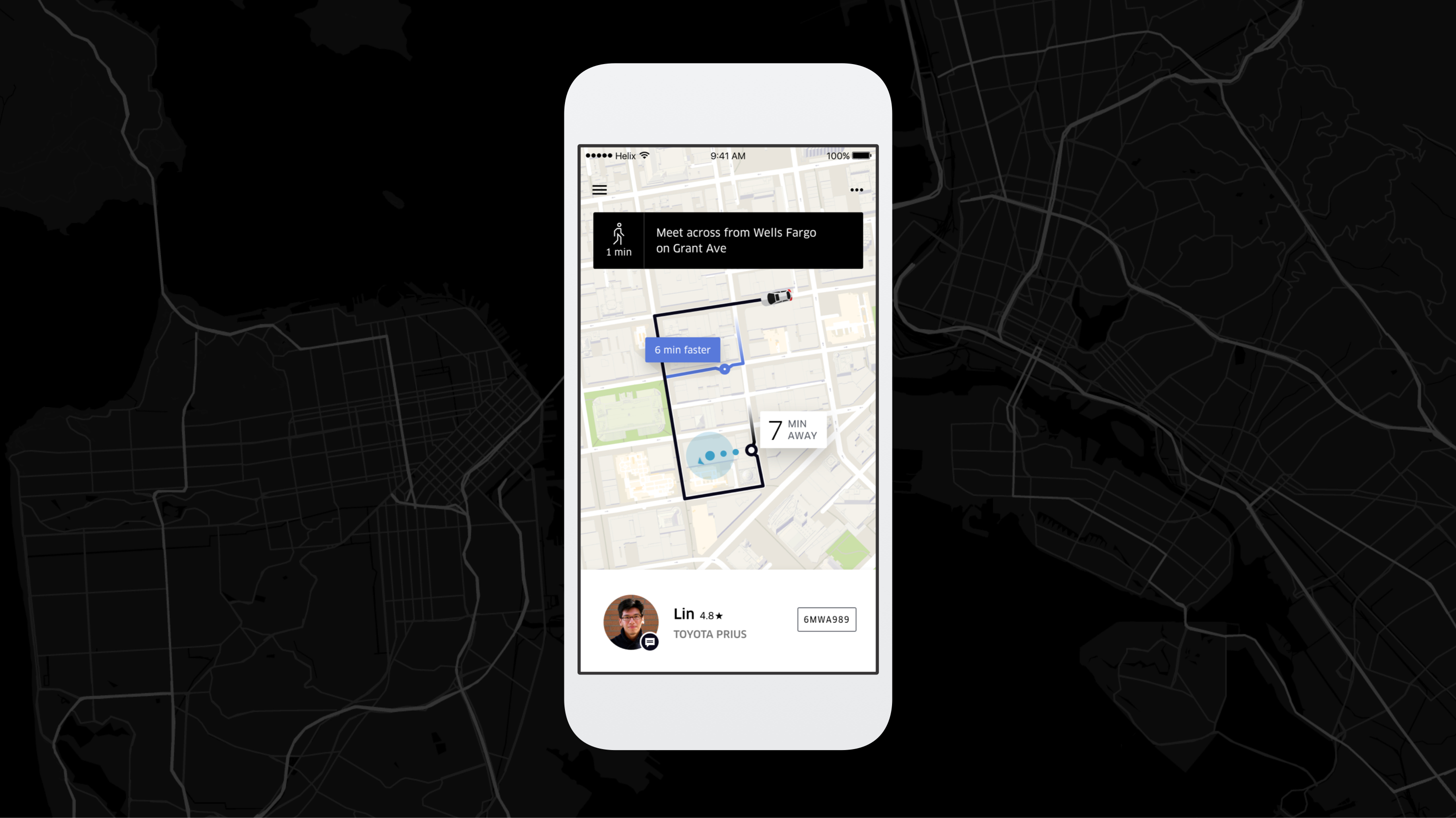
Introducing Rendezvous
In an age where everything is demanding your time, Uber gives your time back by making pickups fast, effortless and calm. Uber makes sensible decisions for you erring on the side of protection— informing you in ways that are understandable and actionable.
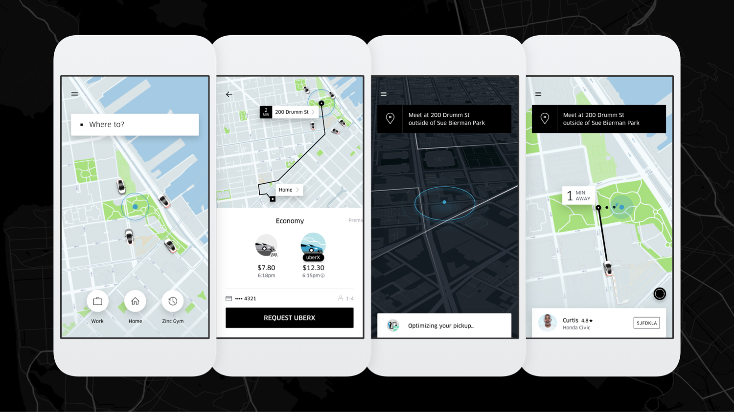
Just request and we do the rest
Uber finds you the optimal meeting place based on who you are, where you are and where you’re going. Uber saves you time without you needing to select a pickup.
People-friendly walking instructions help you better understand and identify your meeting spot. No more nonsensical addresses.
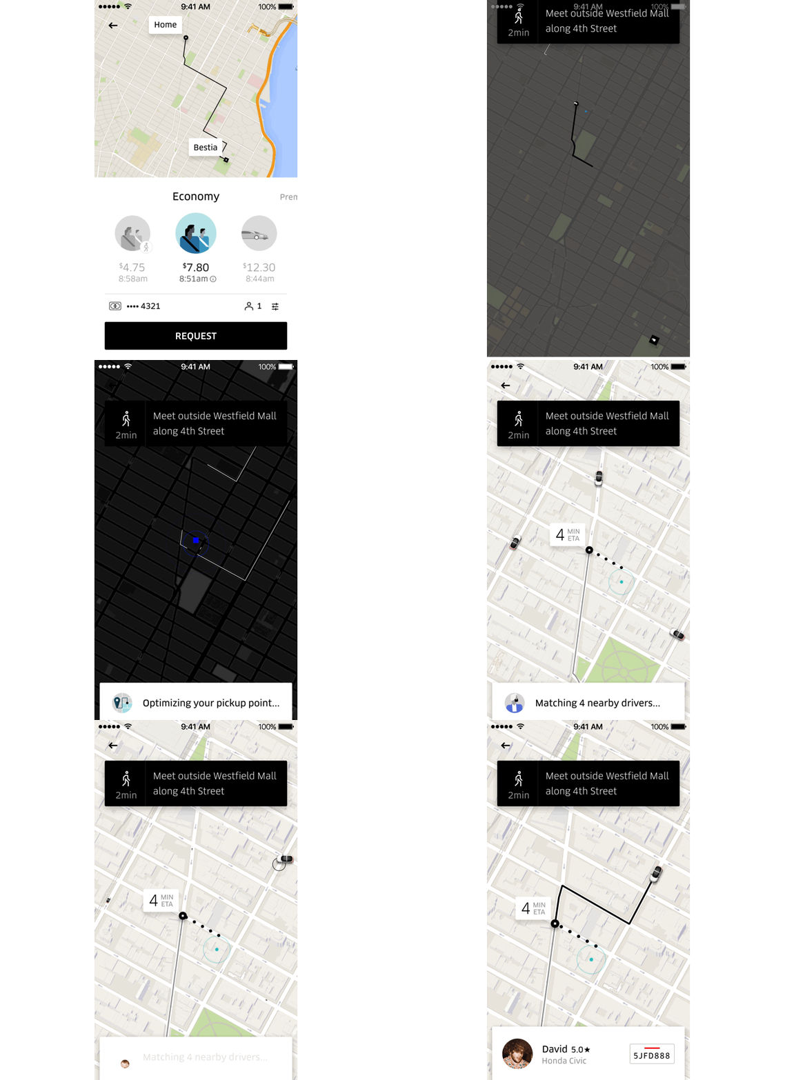
Always Moving forward and faster
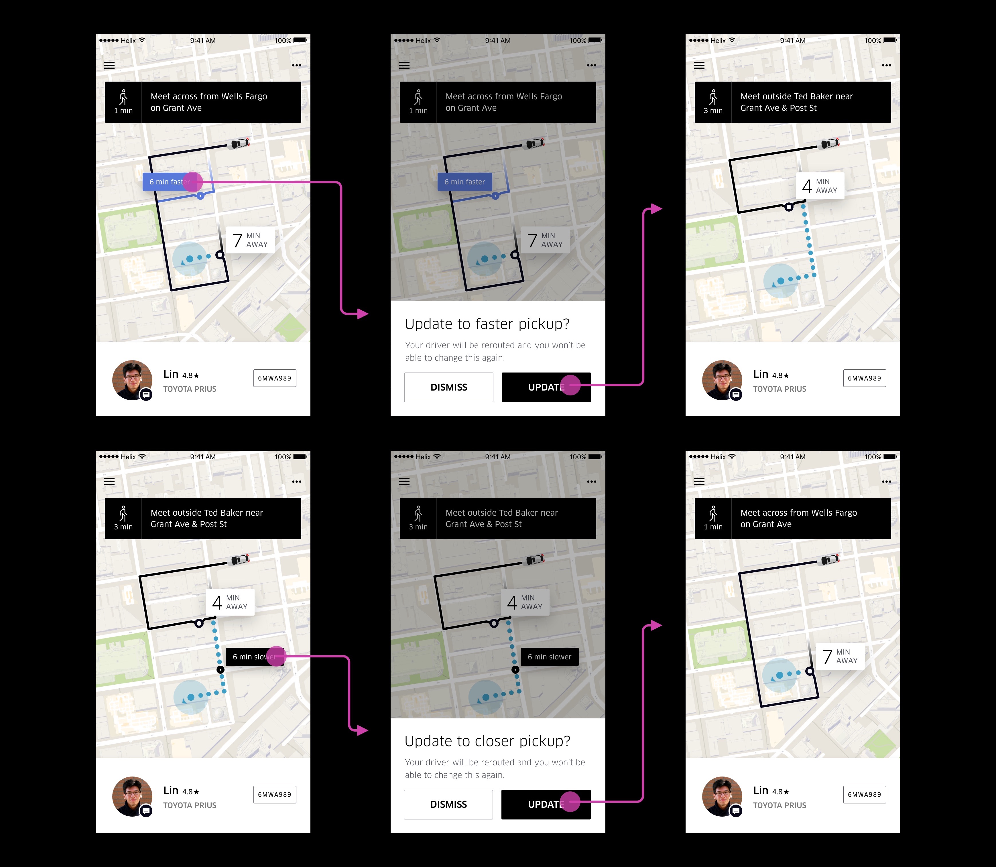
Sometimes there’s a faster way, that requires walking. Uber understands these situations and gives you an option to save time.
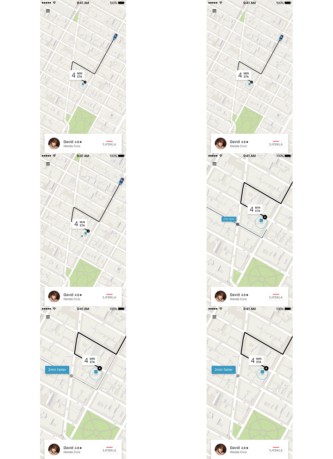
We've got your back
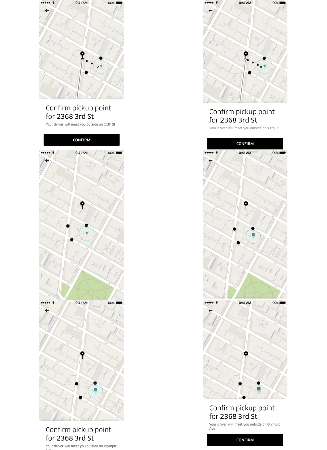
When Uber isn’t sure about your current location, you’ll be prompted to help. Over time Uber will learn more about you and your city, so your Ride will always start in the right place.
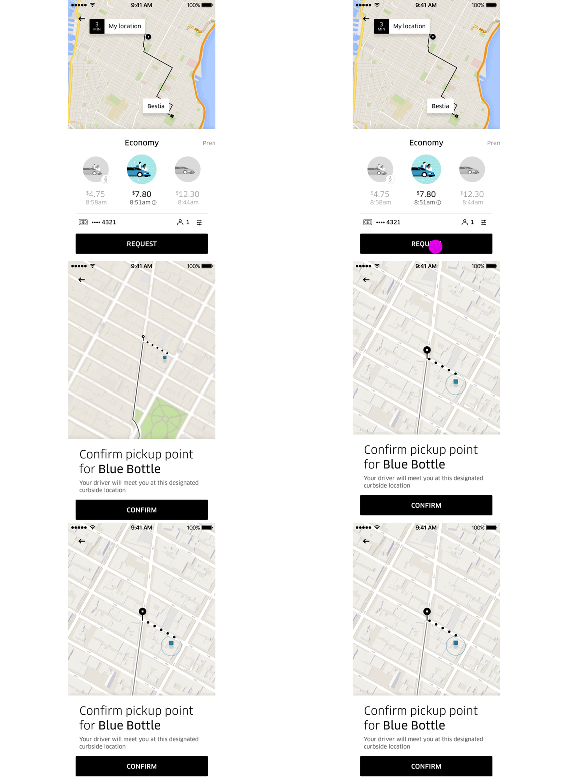
Flexibility and the final say
Sometimes your situation requires precise control over where to get picked up. Uber gives you complete control when you need it.
How we got there
Perfect the pickup for everyone, everywhere
Three primary questions informed my design strategy:
- How do you design for everyone, everywhere?
- What contexts need to be considered?
- What’s the perfect pickup?
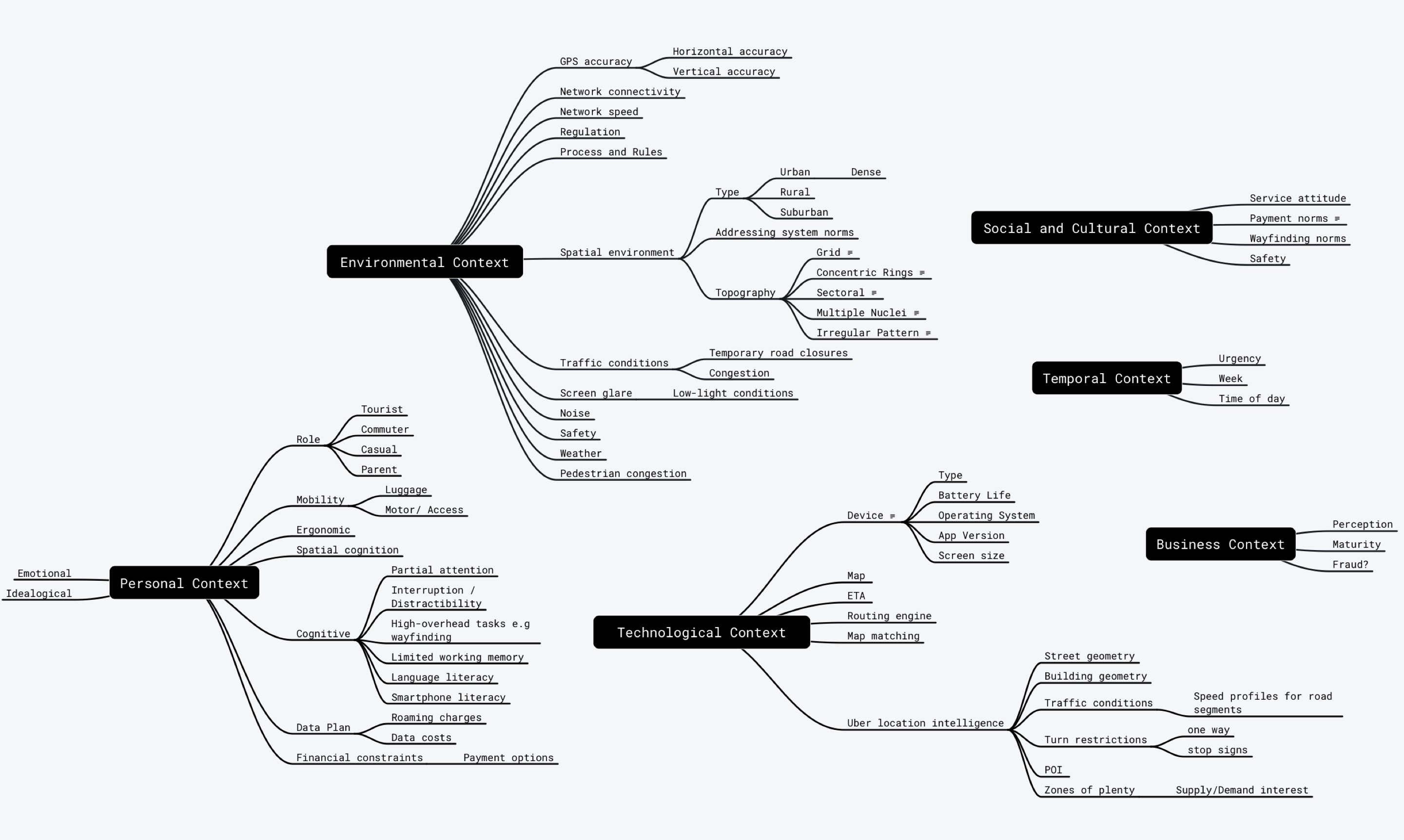
Early on, it was important to understand the different factors that may influence the Rider and Driver experience. I mapped all the possible concepts and translated this into the spectrums and situations framework.
A more inclusive design
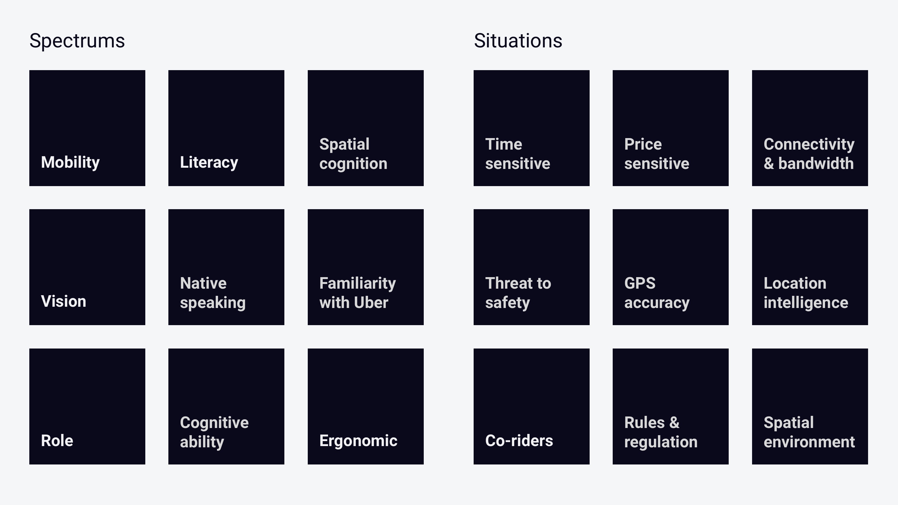
The existing Uber app was poorly designed for users who weren’t reflections of people that work in the San Francisco Uber office. To move beyond the existing biases, I tried to educate the team with an approach to designing for everyone, everywhere.
The spectrums attempt to highlight the range of temporary or permanent challenges to consider when a person is interacting with Uber.
The situations attempt to highlight situational challenges that everyone experiences. A situation is a temporary context that affects the way any person interacts with Uber for a short time.
“Historically, Uber poorly empathised for users who weren’t reflections of people that work in the SF office.”
This framing was used to destroy any stereotypes that the team had about people and marketplaces. The goal was to create design solutions that scale and extend to any combination of these contexts from the outset.
Degradation to adaptation
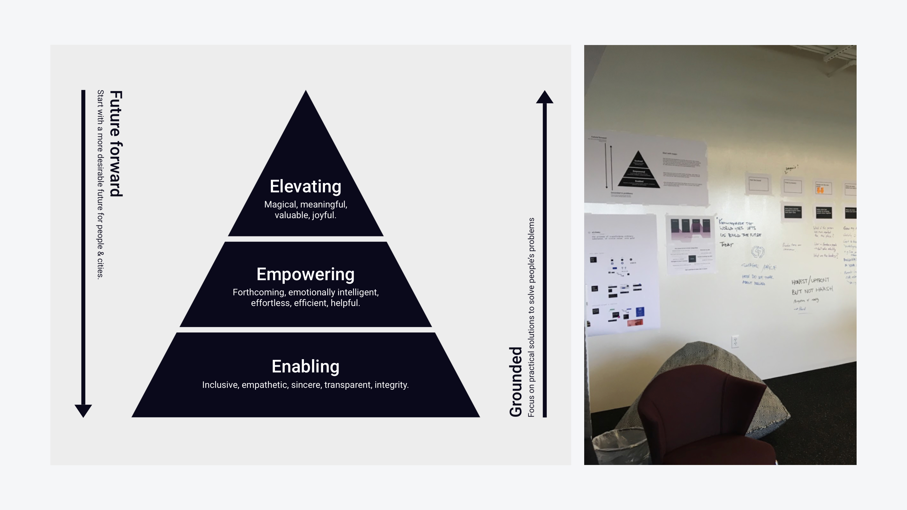
I created this additional hierarchy of needs framework to reframe our conversations about quality and features.
Instead of starting with a San Francisco-centric design and degrading for what the team deemed as the other challenging marketplaces we needed to start with a minimum bar of quality to enable rides for people in all contexts.
The framework helped shift from unproductive questions like “How is this going to degrade for Nairobi?” to “How might we enable a destination first design for cities without a traditional addressing system?”
Working Backwards from Perfect
I reversed the polarity of the imperfect pickup to jumpstart creativity. Four key design challenges emerged:
- How might we better understand where the Rider is?
- How might we form a pickup plan that minimizes effort and saves time?
- How might we remove the need for a map entirely?
- How might we better adapt to the dynamic nature of cities and human mistakes?
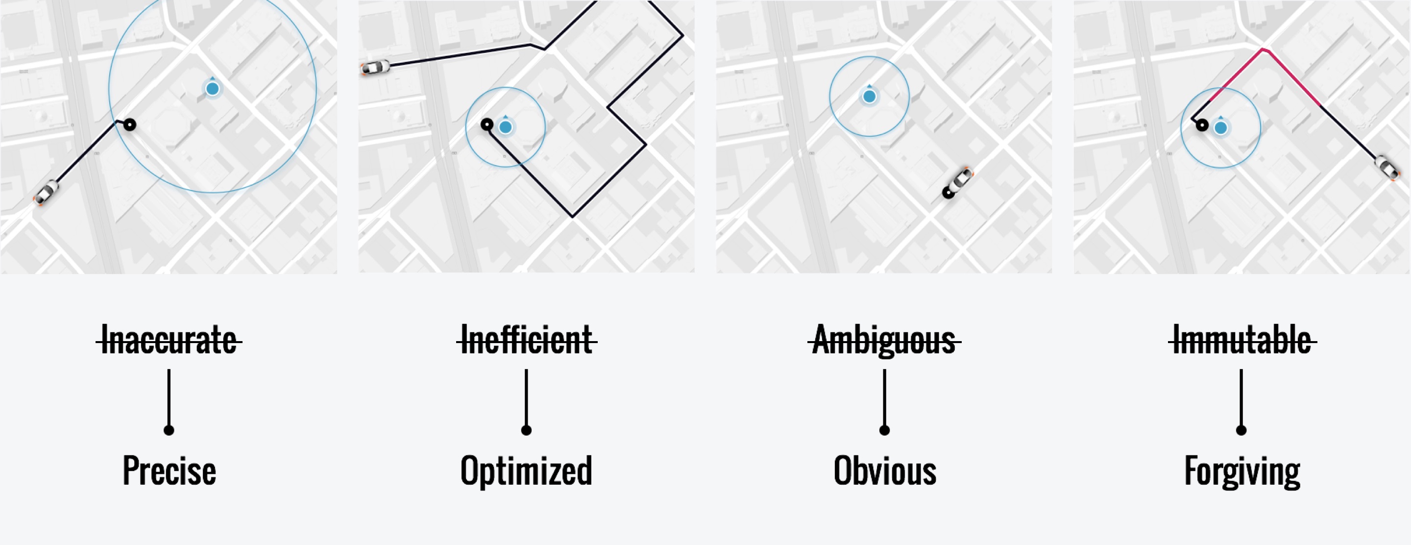
From Inaccurate to Precise
Better Understanding Where the Rider Is
A major reason problematic pickups occurred were because getting an Uber relied heavily on the Rider explicitly setting a precise pickup location to meet. Not doing so, causes the Driver to be sent to the default device location, which half the time is wildly inaccurate.
Our data revealed that:
- 50% of Riders globally don't explicitly set a pickup location.
- Half of all sessions are at least 100m inaccurate.
- 45% of sessions have an improved GPS accuracy by the time of request. We do nothing with this information.
Based on these insights, I proposed two key feature ideas Destination First and Live Locations to help better understand where the Rider is. Central to the features, were these key ideas:
- Stop relying on the Rider setting their pickup location. Do the heavy lifting on behalf of the Rider.
- Carve out more time for the GPS to warm up.
- Capitalize on GPS updates for as long as possible.
Starting at the end
In order to optimize the pickup experience, there was only one thing we needed to know—the Rider's destination.
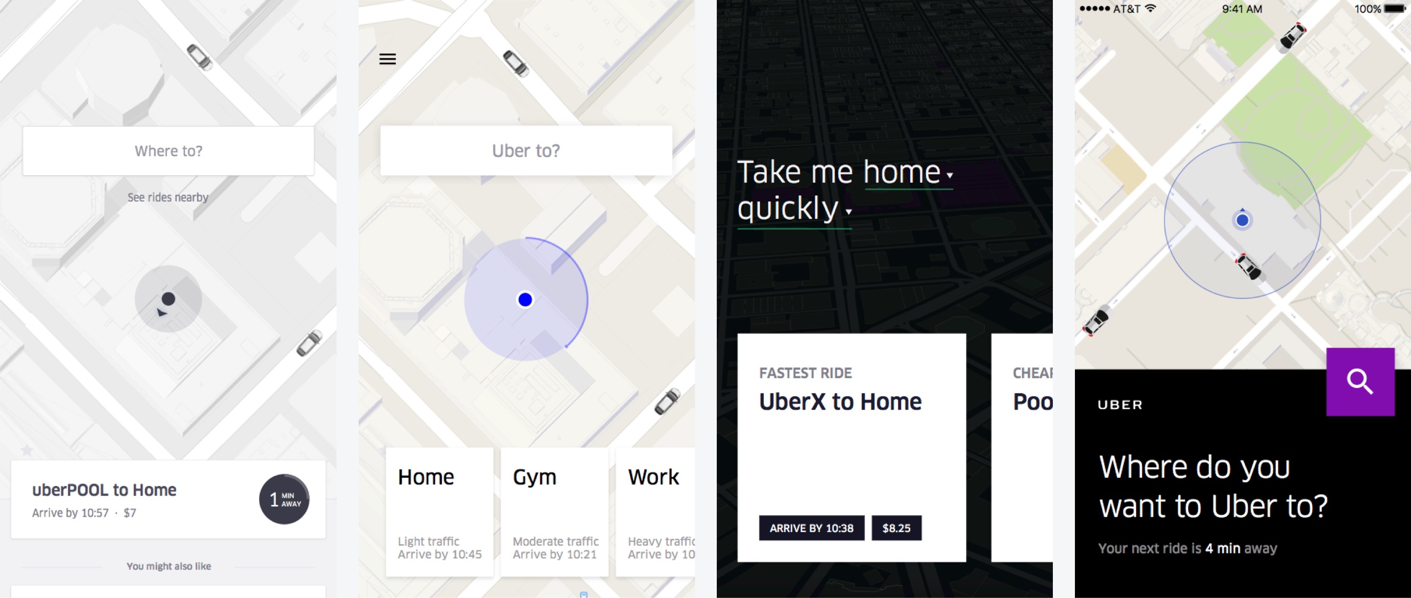
Without much debate, the team agreed that asking “Where to?” upon app launch matched the mental model of the Rider. It was also useful in unlocking more advantages, such as providing the user with upfront fares, estimated arrival times and allowing more time for the device GPS to warm up to aid the pickup experience.
To compensate for the new speed bump, I designed the accelerators feature—a predictive set of shortcuts that gives the Rider 1-tap access to their most likely destinations at any given time.
De-risking the new flow
We feared that the new destination first experience would cause issues because it was more friction and a fundamentally different flow.
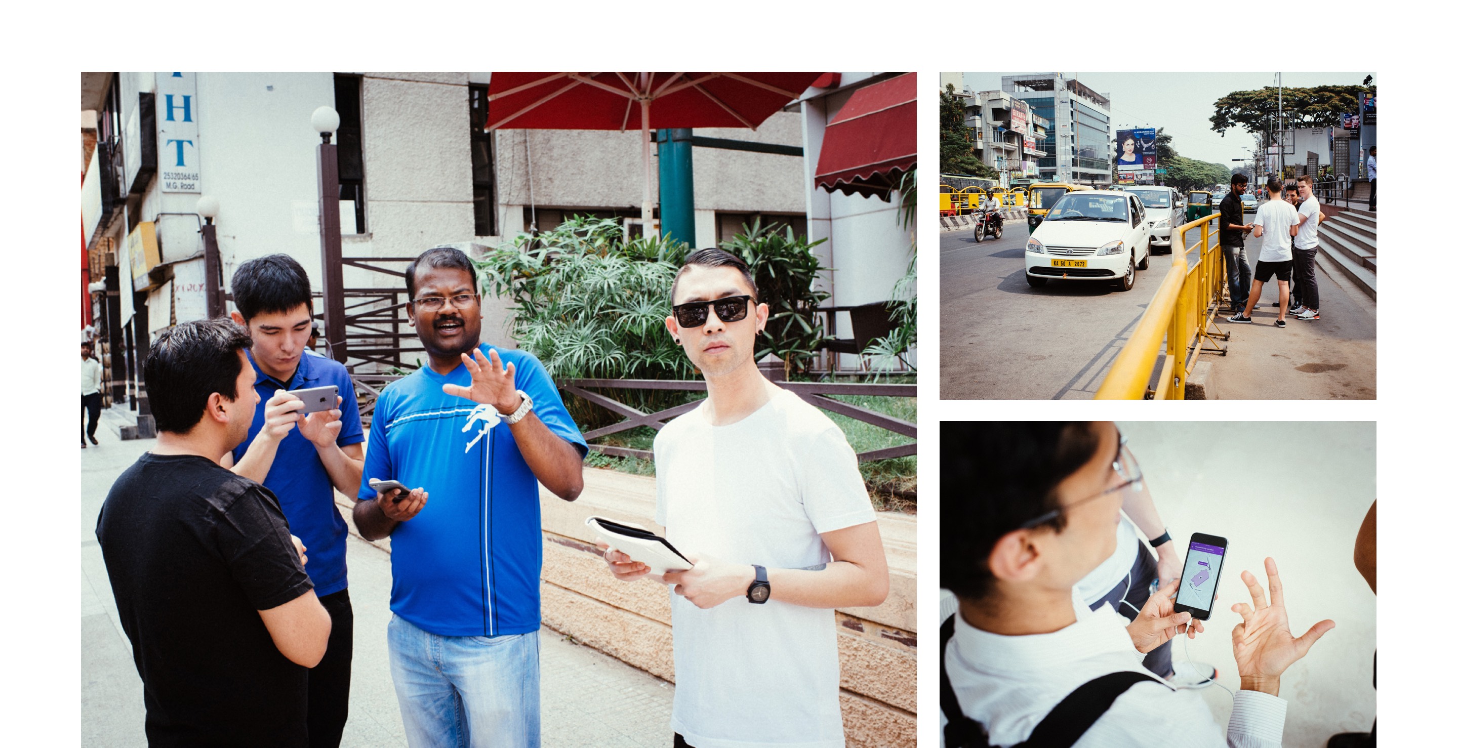
In order to de-risk some of our assumptions, we travelled to Bangalore, Delhi, Ahmedabad, Guangzhou and Shanghai to test an early prototype of the designs.
To our surprise, not a single participant noticed the different sequencing of the flow or had trouble with it. The destination accelerators resonated well with participants, confirming our intuition around designing for speed.
Live Locations
Live locations feature was born by questioning whether we needed to default to any pickup location at all.
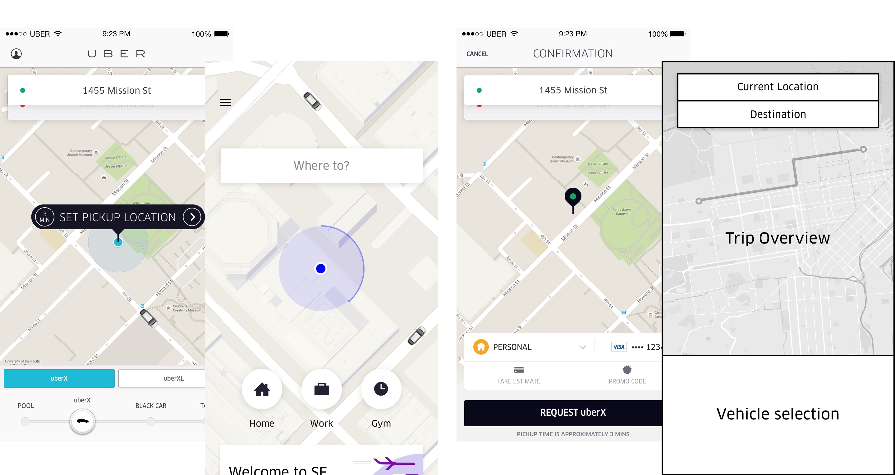
Rather than lock on the Rider's location upon app launch (which roughly 12-15 seconds for an accurate fix), the app continues sensing, asynchronously updating as the GPS updates. The most accurate GPS location is obtained at the last possible moment—at the time of request.
This required a big design shift for the posture of the experience. The challenge was shifting from set your pickup to where and how do you want to go?
Inspiring confidence on the confirmation screen
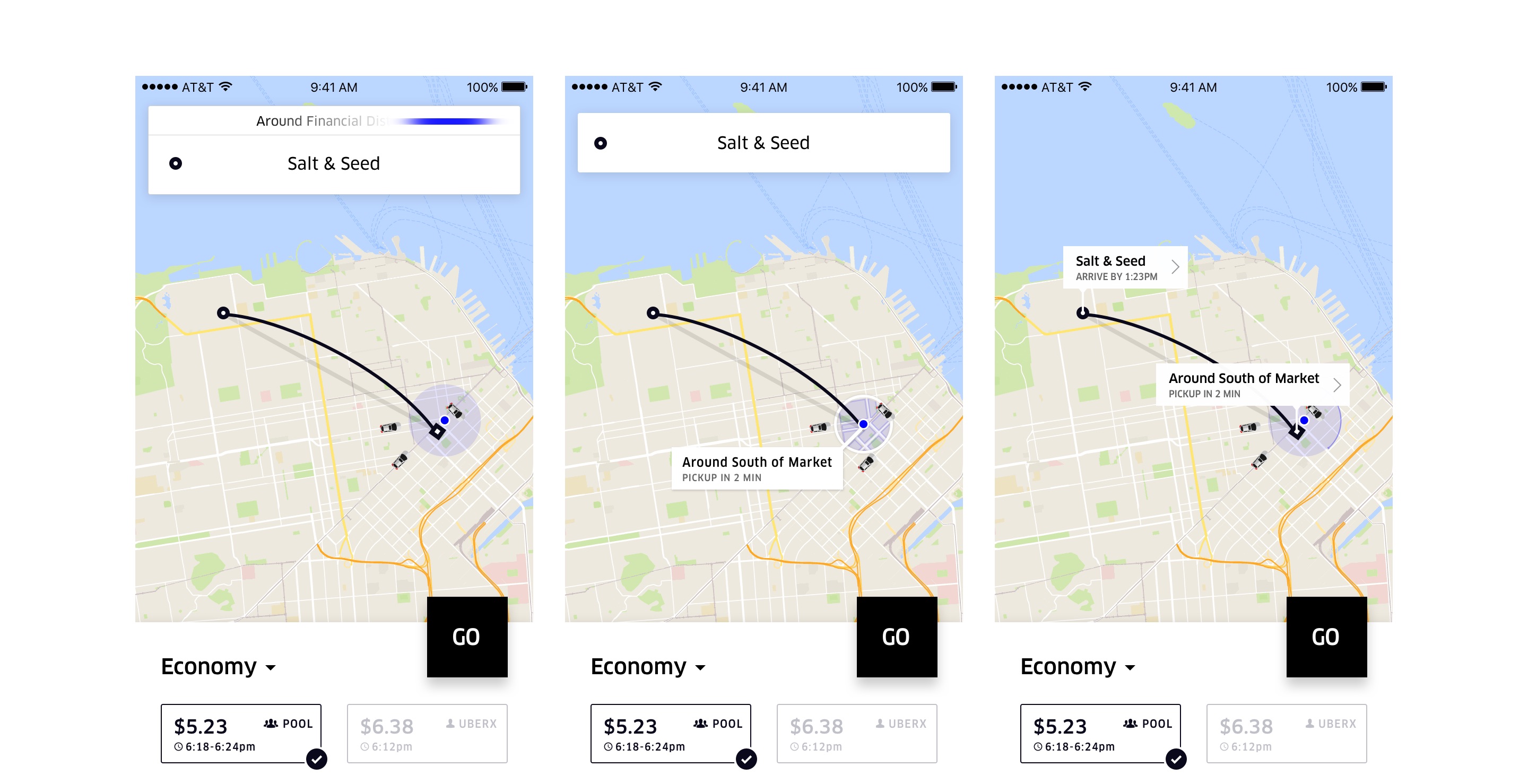
If the new experience was to do the heavy lifting on behalf of the Rider, the confirmation screen needed to inspire confidence and show how the pickup experience was being taken care of.
A key design challenge was to consider how much emphasis should be given to this always sensing state.
The riskier design decisions I made was to obfuscate the pickup location entirely during the core app flow. The idea was to present the overview of the trip to persuade Riders to focus on selecting how they wanted to get there, rather on where to get picked up— since Uber would take care of that.
This meant the UI needed to inspire confidence for the majority, and those who wanted to assert control needed to know how to discover the feature. It also meant that when we couldn’t optimize on the users behalf, we needed to occasionally ask the user for help.
Over-designing for anxiety
The goal of these designs were to reveal the accuracy of the GPS location as it resolved. I assumed that transparency was the key to building Rider trust. After testing many iterations of this experience, we repeatedly observed that:
- Ambiguity and resolution concepts were mostly missed.
- Riders assumed that the app knew their current location and didn’t actively look to confirm.
Riders were not anxious or thinking about the GPS accuracy at all. My anxiety, further compounded by stakeholder feedback was being reflected in my designs. The GPS dot and location tooltips were loaded with this anxiety and I felt like I had exhausted all possibilities.
After the third round of poor testing, I killed the idea in favor of a more simplified and balanced interface that reflected what Riders were focussed on.
From Inefficient to Optimized / Immutable to Fluid
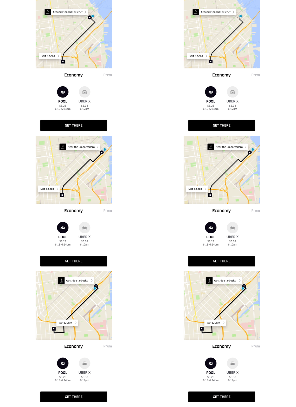
Giving Riders and Drivers back their time
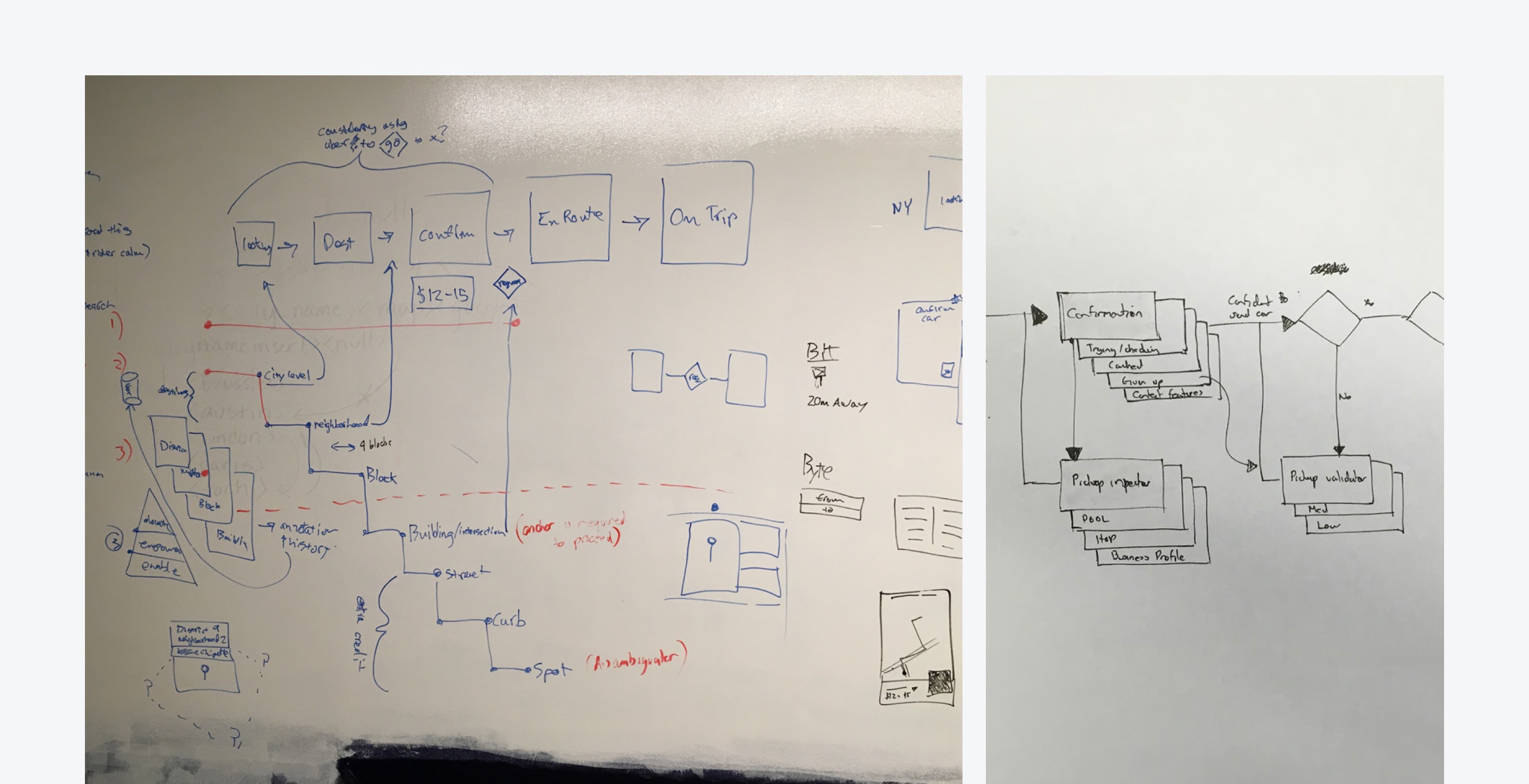
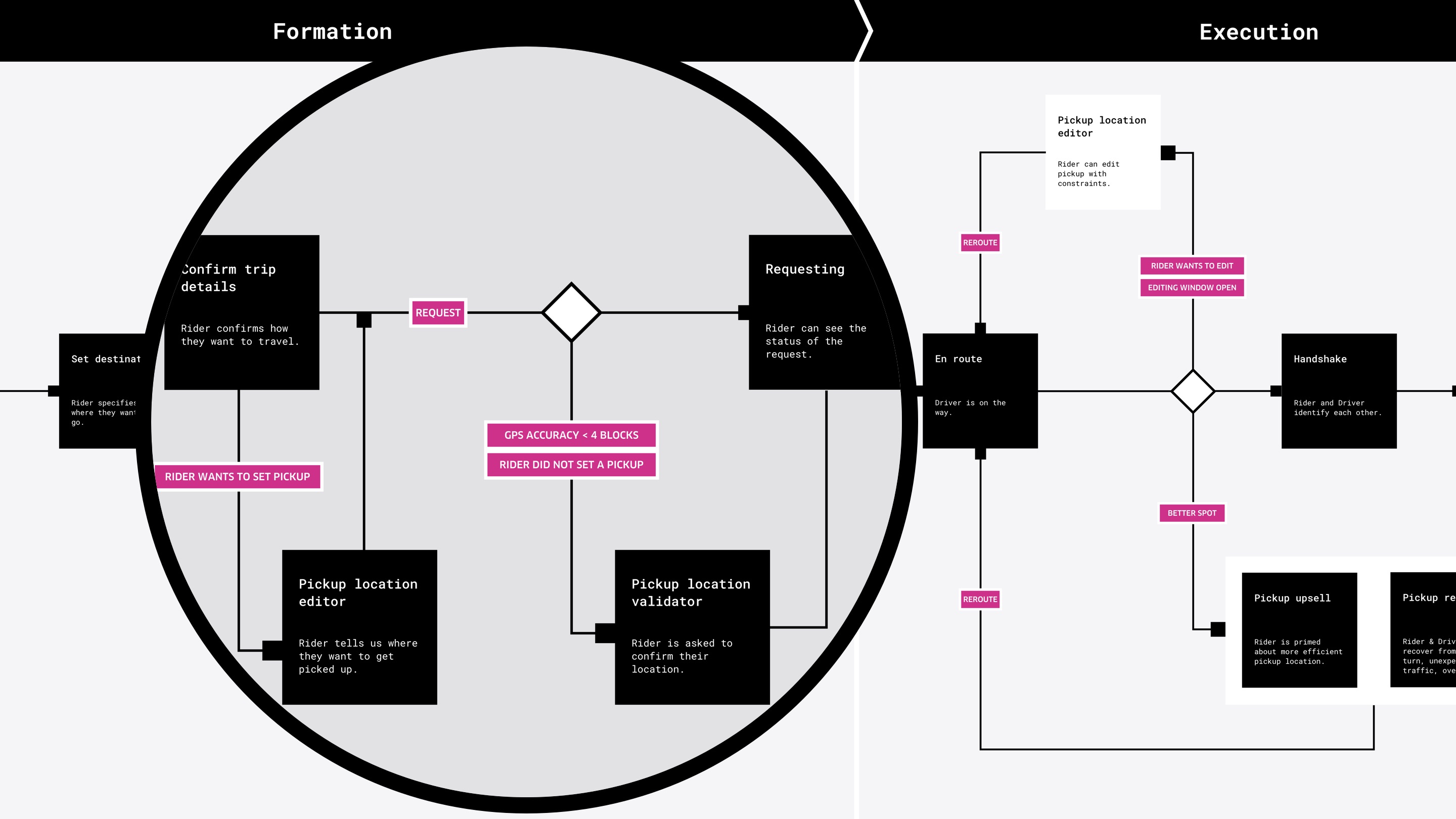
Knowing the Rider’s destination and the most accurate understanding of their location allowed us to do the heavy lifting and select the most optimal pickup location. The system needed to be smart enough to just work when it could, and humble enough to intervene when it couldn't. This system called adaptation was by far the most complex problem of this project.
Foundational to the adaptation framework were these concepts:
- A confidence score would determine whether to choose a spot on behalf of the user, or to disambiguate their location. How we calculated this confidence score would be an ongoing project to improve.
- We needed to respect Rider control and agency. Design patterns needed to allow for opting in, opting out or taking complete control.
- The system needed to be flexible enough to learn about Rider willingness. Don't design based on the assumption we will know the right answer.
Intelligent pickups
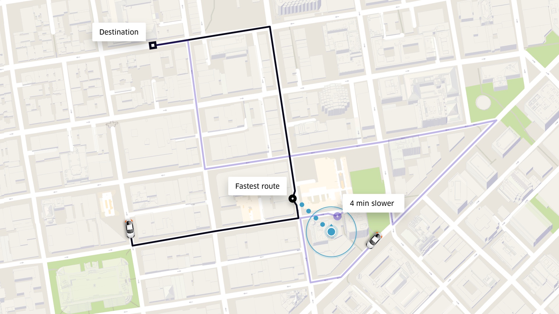
Making trips efficient required that we move beyond dispatching the closest car, to dispatching the most optimal* car. This presented several design challenges:
- Getting the Rider to walk to a nearby pickup location.
- Creating heuristics to decide the optimal spot.
- Adapting when we don’t know where the Rider is.
- Balancing smart defaults with choice and control.
*Optimal refers to the car with the fastest route to destination based on a set of nearby candidate pickup locations
Adaptation - a flexible architecture
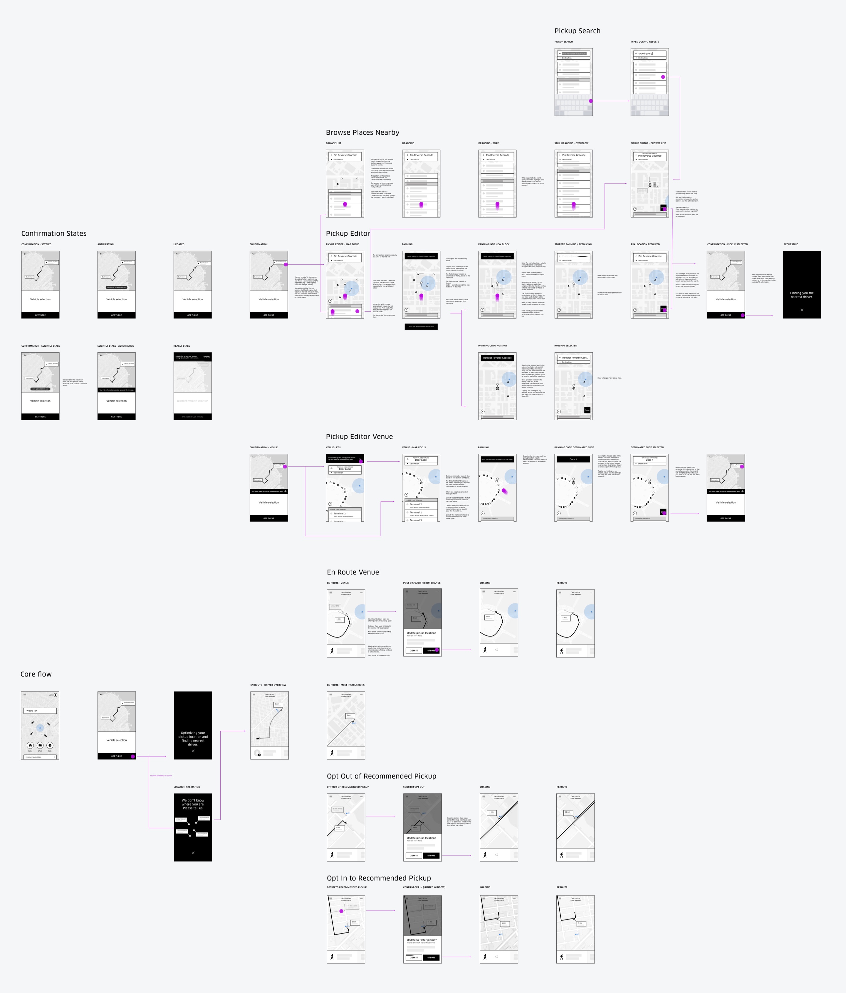
I designed the flow based on the idea of a location confidence score. If Uber is confident of the Rider's location, it does all the heavy lifting. Otherwise, the app prompts the Rider to validate their location.
Instead of designing for the right answer, I designed a flexible system optimized for learning and optionality.
From Ambiguous to Obvious
Communicating location in a more intuitive way
A critical part of the rendezvous experience is that Riders and Drivers have a clear understanding of where to meet and how to get there. The existing Uber app didn’t do a good job of supporting wayfinding, relying mostly on street addresses and the map.
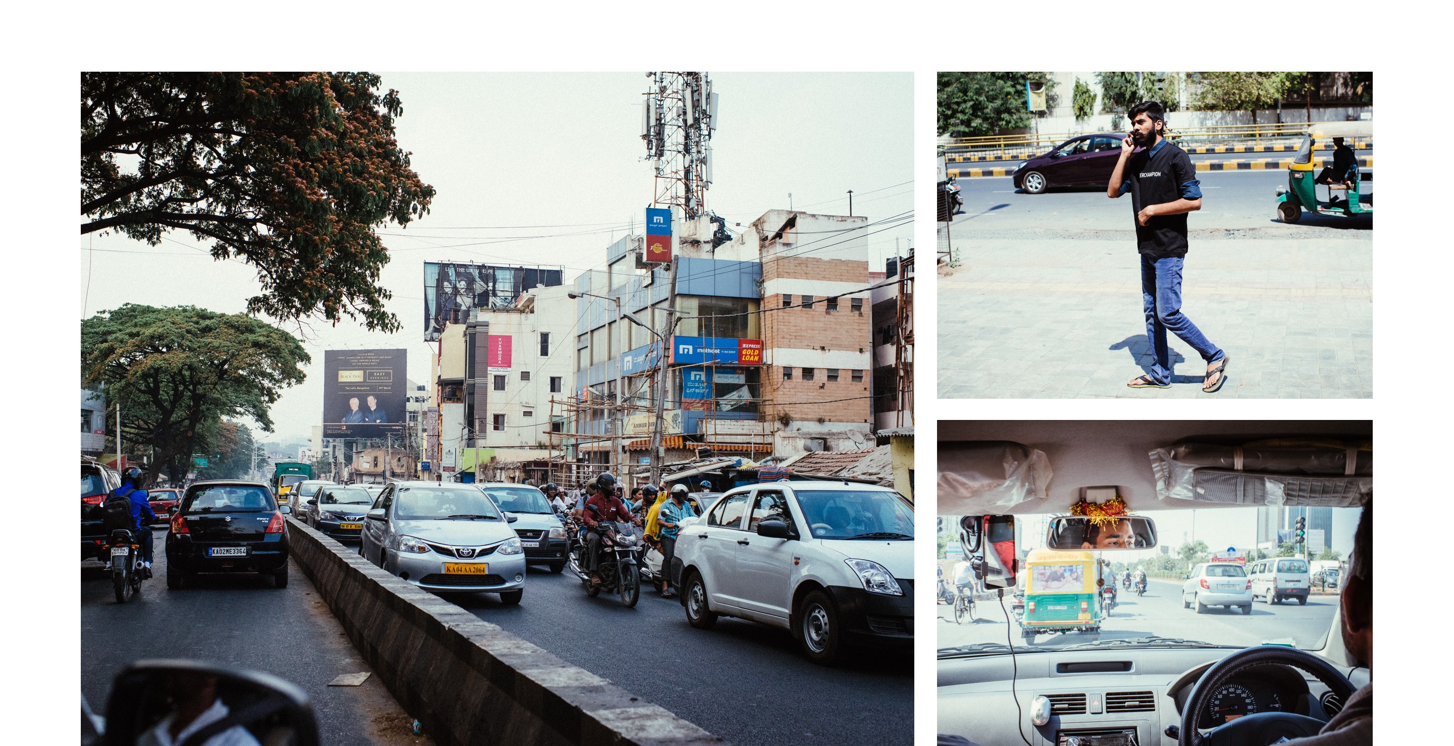
During our research trip in India, we observed many wayfinding challenges. Limited street signage, intense traffic on the roads and sidewalks and poor GPS accuracy meant that the Riders and Drivers used POIs to coordinate their pickup location (in spite of what was formed in the app).
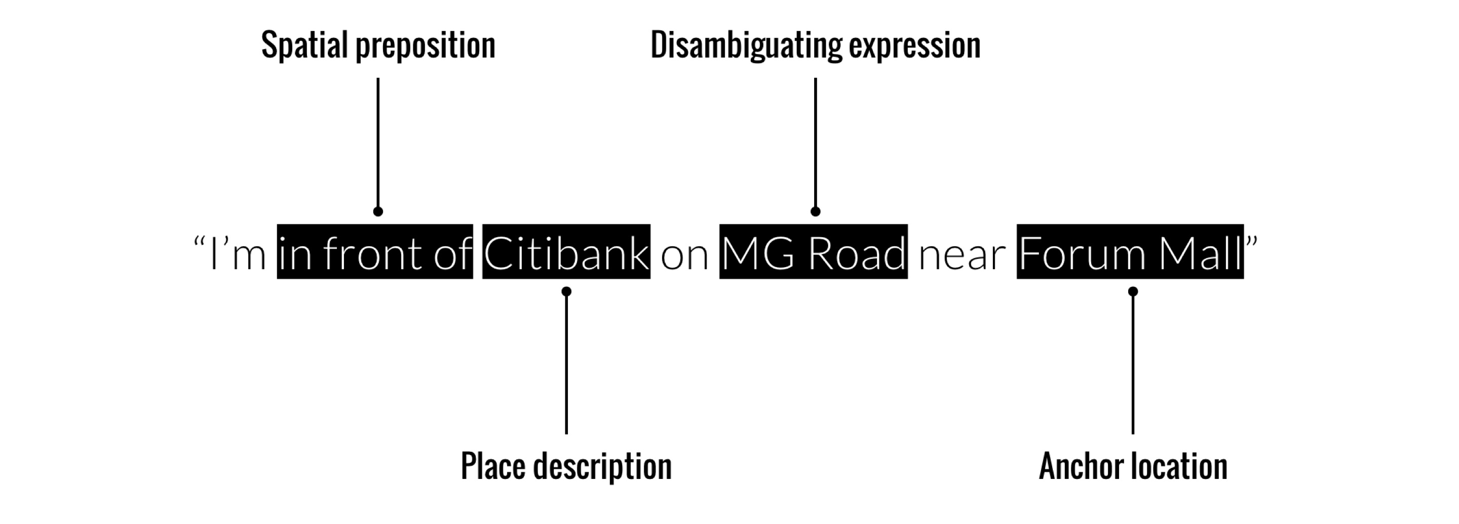
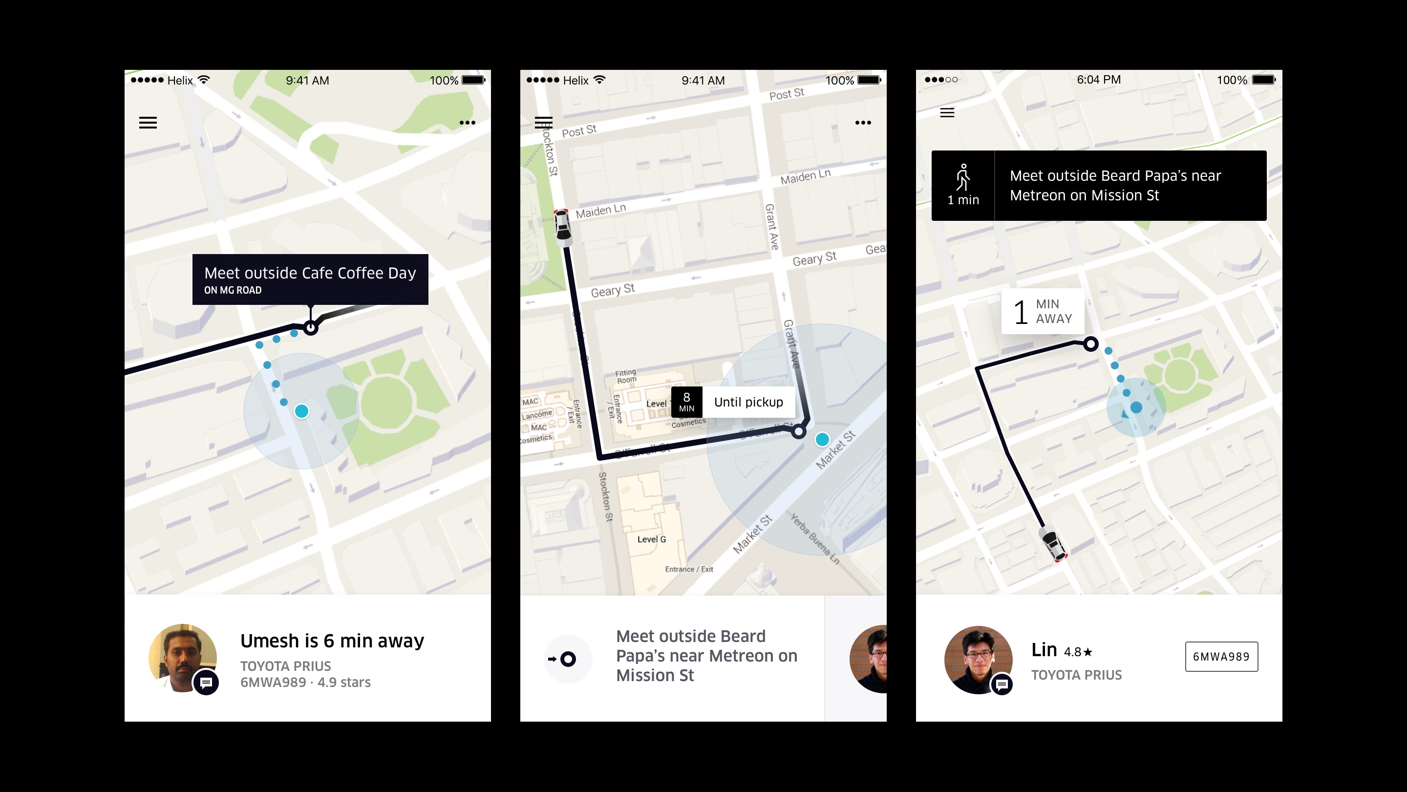
We found that there were structural patterns inherent in their communication, which inspired the Geotalker feature.
Geotalker
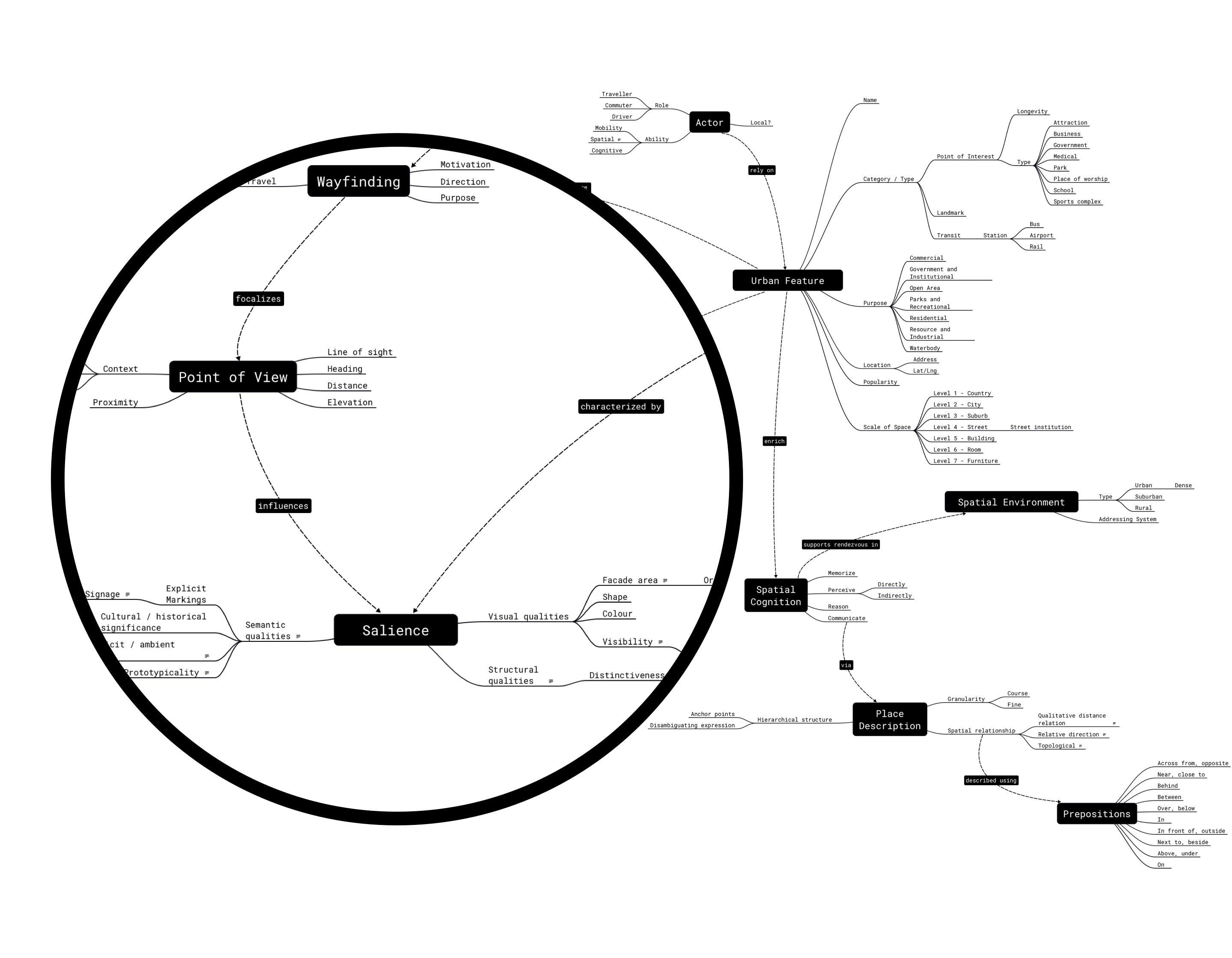
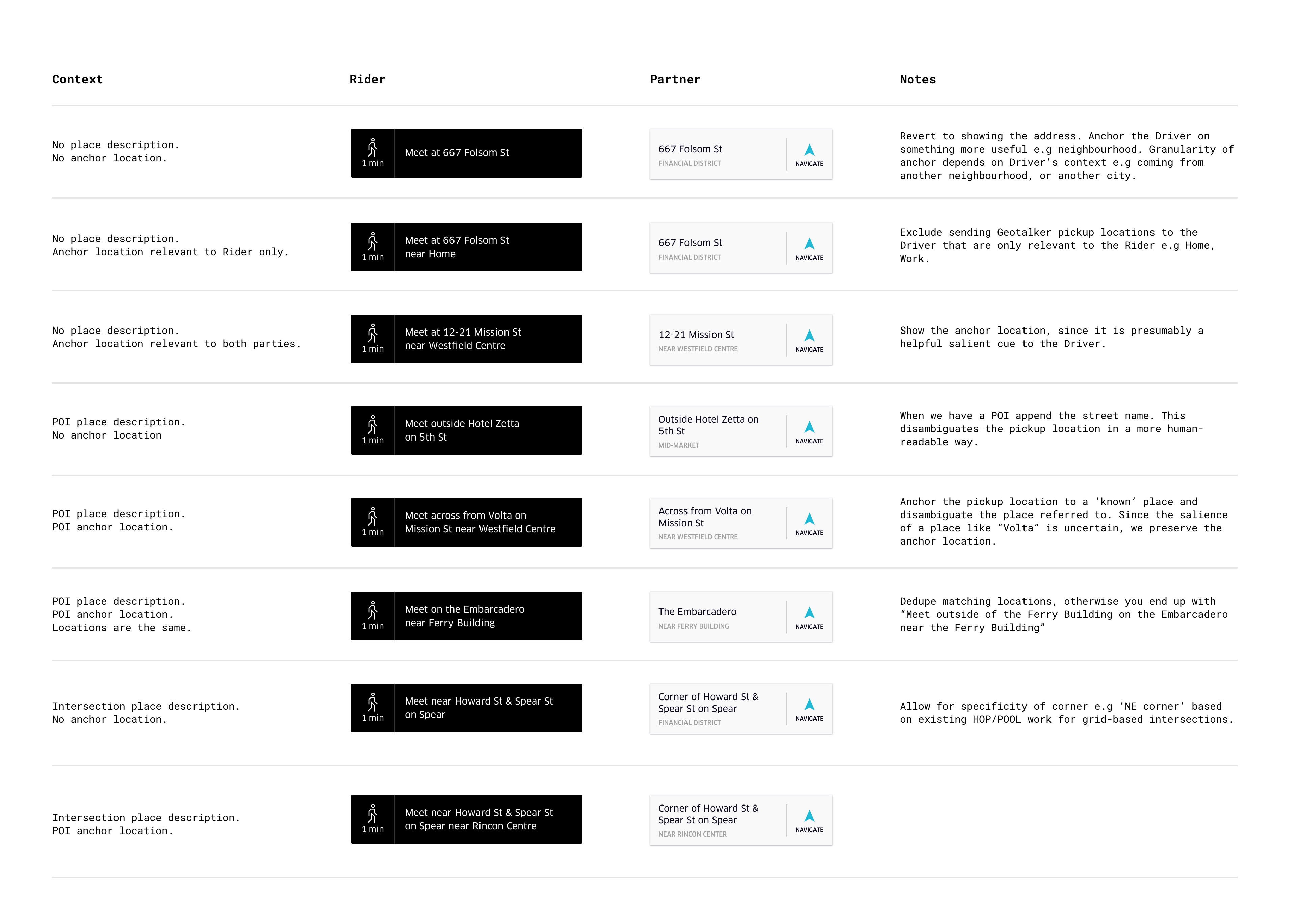
Geotalker is a place description framework that mirrors how the human mind organizes spatial knowledge. It works by using a set of heuristics to translate a reverse geocoded street address into a place description phrase to support wayfinding, spatial awareness and communication.
I started out by creating a concept model for wayfinding and spatial cognition. The exercise helped me come up with the idea that features of the urban environment could have different levels of salience, depending on the point of view of the Rider or Driver.
The larger vision was to create a system where place description leveraged the POI with the highest level of salience, based primarily on heading direction and other factors. The system would test different labels and self-optimize based on the quality of the pickup experience.
However, given the speculative nature of the idea and reliance on a quality location data set, we decided to experiment with a less intelligent version in the existing app.
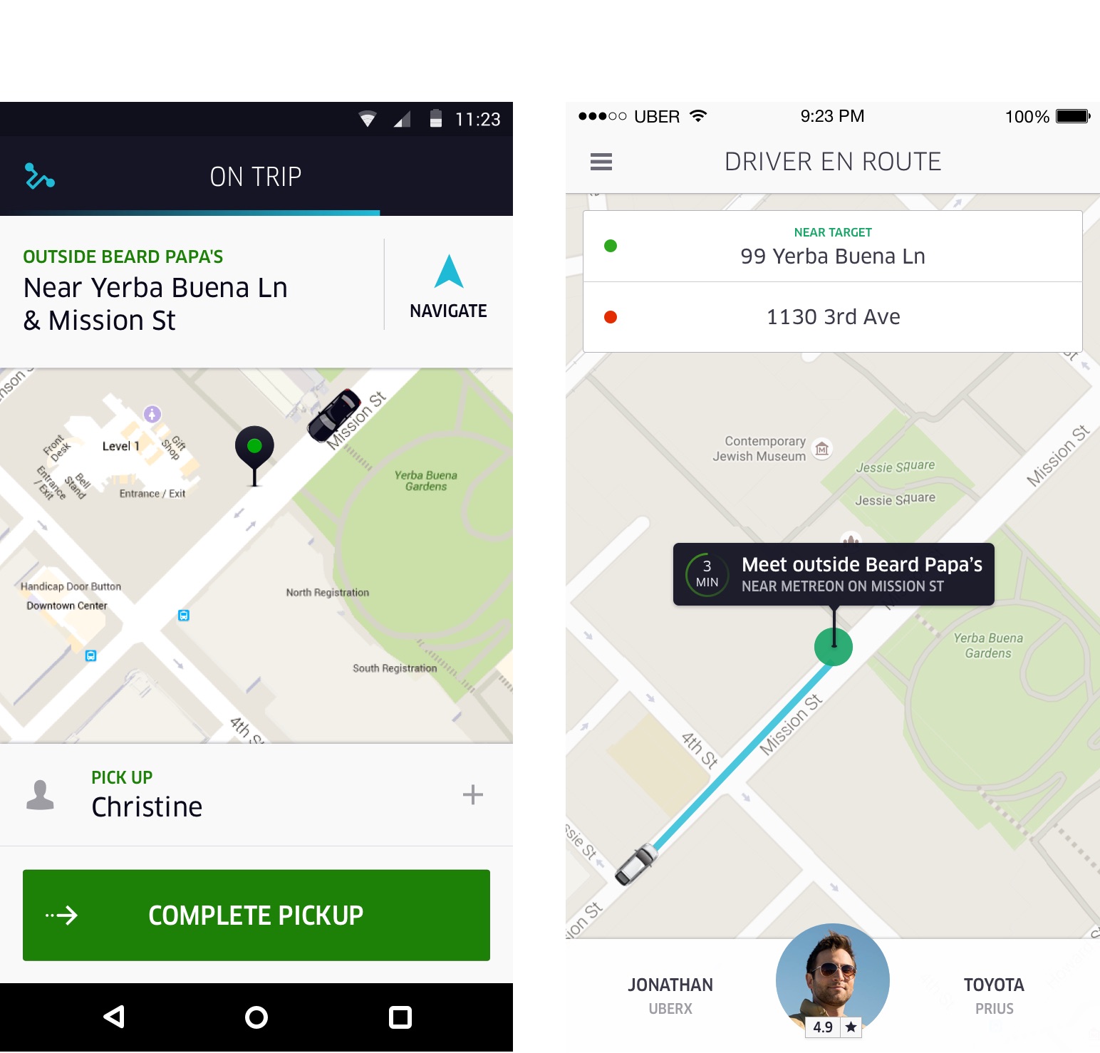
Geotalker reduced ambiguity in the pickup experience
Early experiments resulted in significant decreases in the distance between pickup request location and actual pickup location and contact rate. We concluded that Geotalker helped to reduce ambiguity of the pickup location.
This was enough signal necessary to launch the idea in the redesign.
The Launch
The Most Radical Update Since 2012
In the 5 months after my involvement on the project, the team continued to evolve and polish the visual design, as well as finesse the finer functional details as the app was being built. Although I was not part of this process, it was great to see most of my work brought to life.
On November 2nd, 2016 the new Rider app launched globally—an impressive achievement by the team, considering that it was a complete redesign and rebuild from scratch.
The Impact
Positive results and much more to do
The redesign of the Uber Rider app on iOS and Android has had a positive impact on the pickup experience, at the time of writing (3 months since launch). However, contact rate has not been significantly decreased which means Riders and Drivers continue to contact each other to confirm or coordinate pickup details. I believe this to be a behavior change that will reveal over a longer period of time.
The error distance between requested pickup location and actual pickup location decreased by 34%
Driver wait-time decreased by 20%
High-precision pickup rates increased by 17%
Multi-contact rate decreased by 3%
For confidentiality reasons I have omitted the actual values for these metrics.
