London By Bike
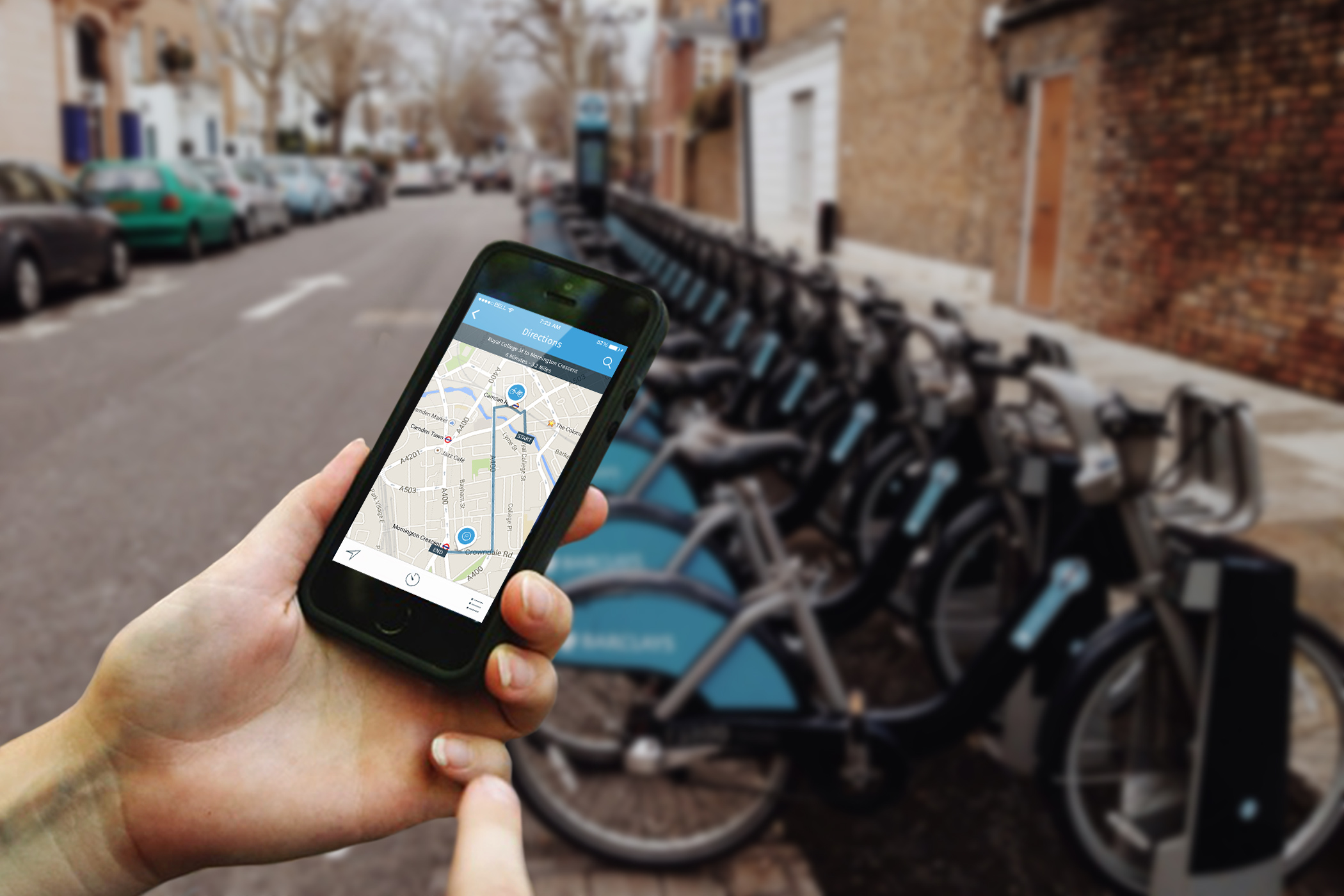
In 2010, London transformed into a city for cycling with the introduction of Barclays Cycle Hire — London's self‐service, bike‐sharing scheme. This is the story of how I made a positive difference to everyday life in London.
To comply with my confidentiality agreement I have omitted and appropriated confidential information. These designs are a reinterpretation of the original.
My Role
I was part of the pitch team and responsible for the experience strategy and design of the iOS app. I lead the UX work, producing all major deliverables and presenting these to the client between November 2011 and March 2012. I worked alongside a junior UX Architect who focused on the Android app.
The Challenge
2 Apps in 2 Months
Our client approached us with two primary objectives —to enhance their app's functionality and usability beyond their competitors; and to promote active lives in the London community.
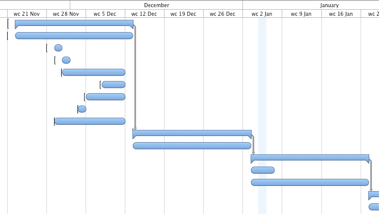
To coincide with the East London expansion of the scheme, our team was under extreme pressure to move fast. We were tasked to deliver an iPhone and Android high‐fidelity prototype to our technical production partner within 2 months. The combination of a fixed deadline, app store submission time, security testing, and usability testing meant I needed to get the experience right in the first four weeks.
Get on your Bikes and Ride!
The London Cycle Hire scheme is an initiative which provides an affordable, sustainable and environmentally friendly transport network in London. Launched on 30th July 2010, the scheme already sees more than 10,000 cycles available in central London, with over 19 million journeys cycled. The London By Bike app launched in April 2011, and had over 50,000 downloads at the outset of the project.
The open nature of Transport for London's (TFL) cycle hire data and an 'open call' to app developers from the mayor himself resulted in a plethora of apps surfacing. These apps share an aim to help casual and annual members use the bike scheme more effectively. Amongst this crowd was our client's app, which was in dire need of an experience overhaul.
The Approach
Focusing on features Goals
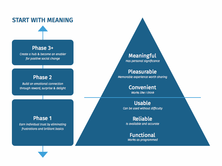
Although our brief was to develop better functionality than our client's competitors, we stressed that engaging in a feature parity war was neither strategic, nor had the best interests of the app's users at heart.
To differentiate ourselves in an already mature and competitive market, we needed to define a desirable role for the app and how it would meet the needs of the scheme's users. We were thrilled by the opportunity to create something more meaningful.
A collaborative culture with lean UX
We opted for a lean approach which emphasised rapid sketching, prototyping, user feedback and design mockups. This created early team‐wide alignment, sparked tons of great ideas and created a strong sense of ownership across different disciplines within my organisation.
Building trust through transparency
Sharing our methods and thinking from the outset helped to build a strong client relationship. Ample opportunities for input at all stages of the project built trust and created a comfortable environment to share ideas—forming a partnership which will serve much value beyond this phase.
Build twice deploy everywhere
Because of the project timeline and fixed date, we opted to build the app using the Appcelerator Titanium Framework which allowed for code reuse and deployment of builds cross‑platform. In hindsight, this was a poor choice that heavily compromised the user experience.
Starting on the same page
Meeting with key stakeholders helped us to understand their business challenges. Together we identified risks and aligned on expectations and constructed a shared vision for the app. Following this, I crafted an experience strategy outlining our phased approach and direction for the app.
The Discovery
What does 'Ride' mean to you?
The discovery phase was a quick, high‐intensity effort that allowed us to define project milestones, audit the existing work, review the competitor landscape, understand our client's vision, and begin research into user needs, behaviours and pain‐points. We also kicked off a technical discovery phase to understand feasibility and constraints.
Our research revealed that the concept of 'ride' represented something different to users of the scheme. Users' motivations for riding and participating in the scheme differed, hinting at different requirements.
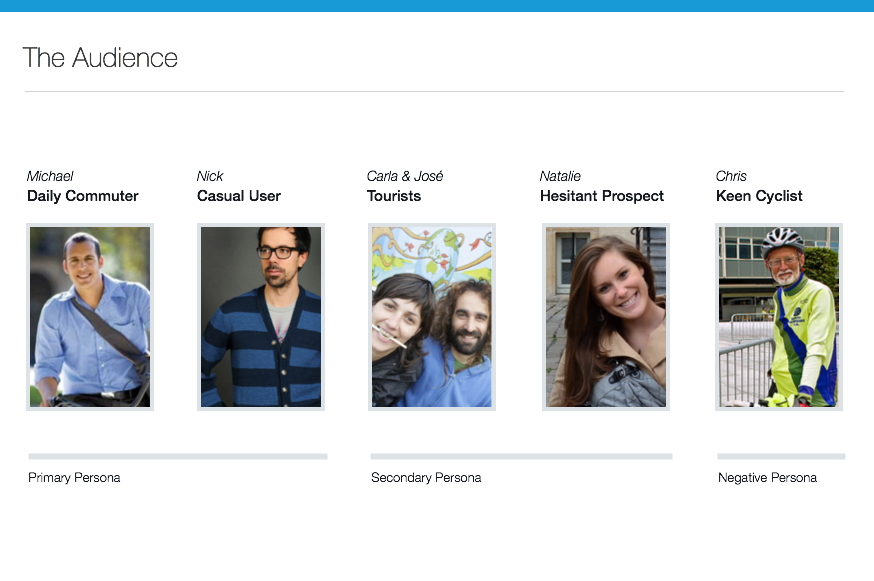
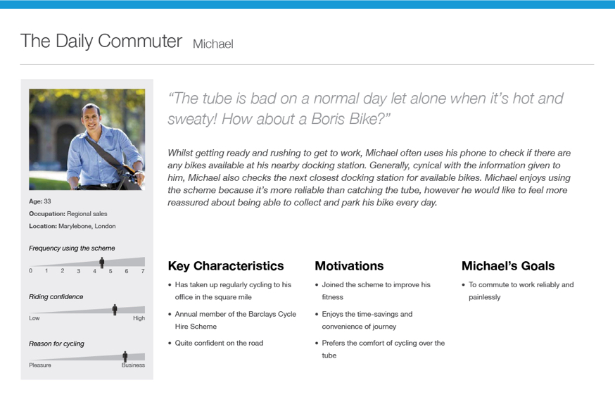
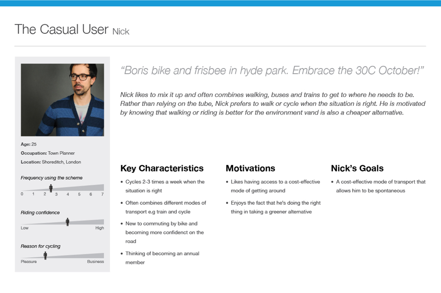
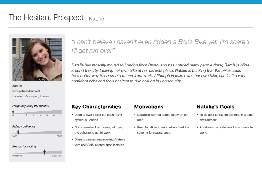
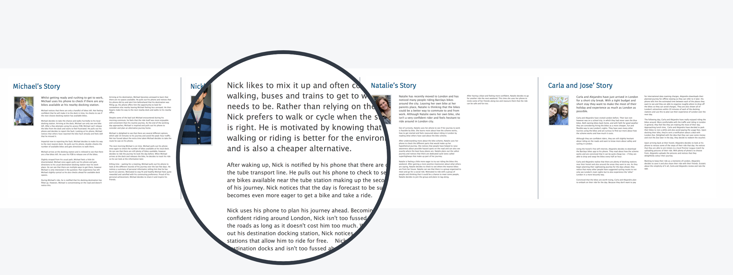
After designating persona types and aligning this with our phasing strategy we were able to prioritise who we would be focusing on supporting in the early stages. The phase 1 app focused on supporting the goals of Michael and Nick, our primary personas. We planned for later phases to support Natalie, Carla & Alejandro and Chris.
We used personas constantly throughout the project to guide design decisions, priorities, and create empathy amongst the client and our team.
“We used personas constantly throughout the project to guide design decisions, priorities, and create empathy amongst the client and our team.”
Our persona hypothesis consisted of five different archetypes which we used to facilitate discussions about our users needs, desires and varying contexts of use. Through careful analysis of our research, we identified sufficient behavioural variables to segment our user audience. These variables could be categorised into activities such as frequency of use of the scheme, skills such as riding confidence and motivations such as reasons for cycling. We discussed the personas with our client to develop a clear picture of who the design of the app would target in phase 1 and later in future releases.
Rider Empathy
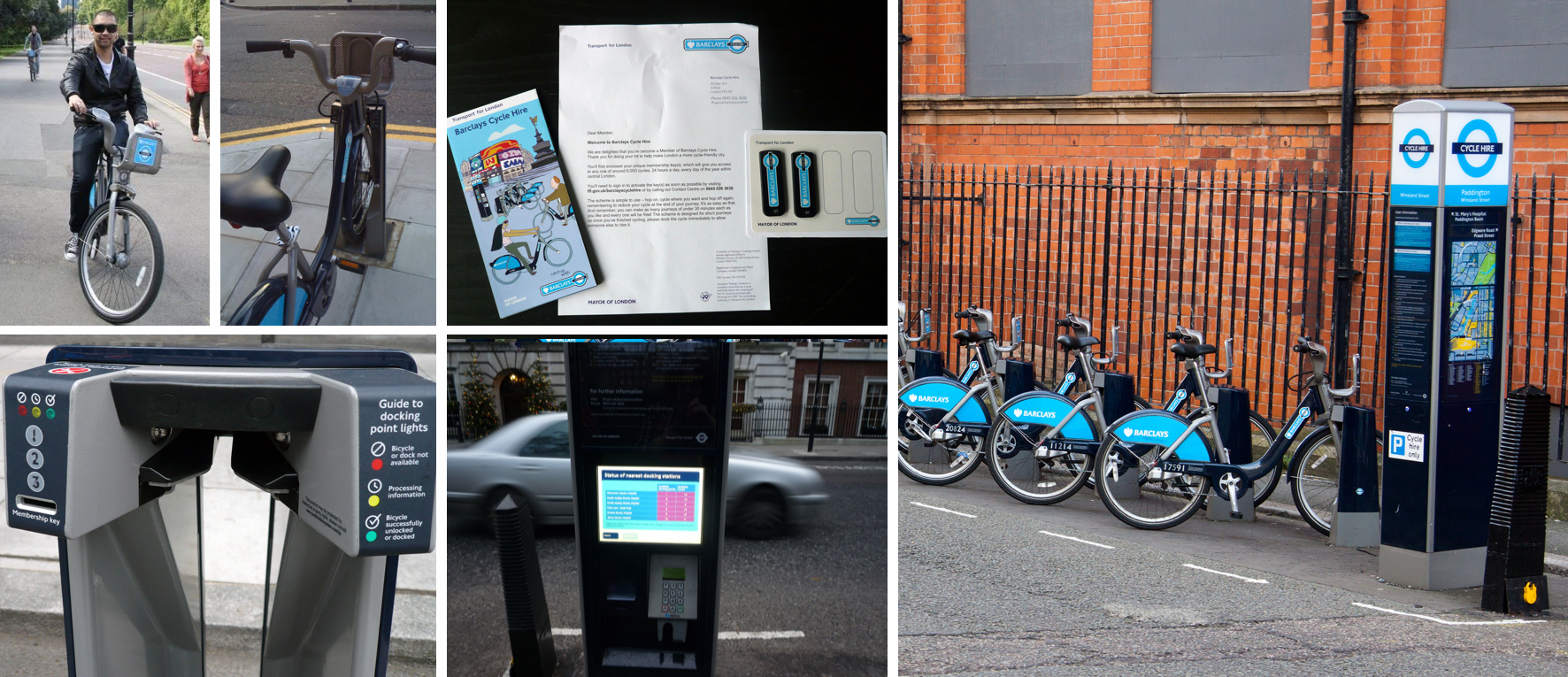
Tight timing meant that we needed to be efficient conducting user research and collecting feedback. Luckily, the scheme's popularity provided us with ample participants. We conducted a range of interviews with stakeholders, co‐workers and friends; looked to the twittersphere to gauge what people were saying; and utilised official reports from TFL to understand users motivations for participating in the scheme. These varied research techniques helped to quickly gain insights into the needs of our users and gave us a concrete understanding of the environment and workflows.
At the first sight of sunshine, I went out for a ride myself.
Visualising the end‐to‐end
We used experience mapping techniques to visualise and communicate the users end‐to‐end experience across various touch‐points with the scheme. This allowed us to represent user pain‐points and see where we needed to focus our attention. Mapping out the users emotions was key to setting client expectations about the aspirational emotional state we were aiming to design for.
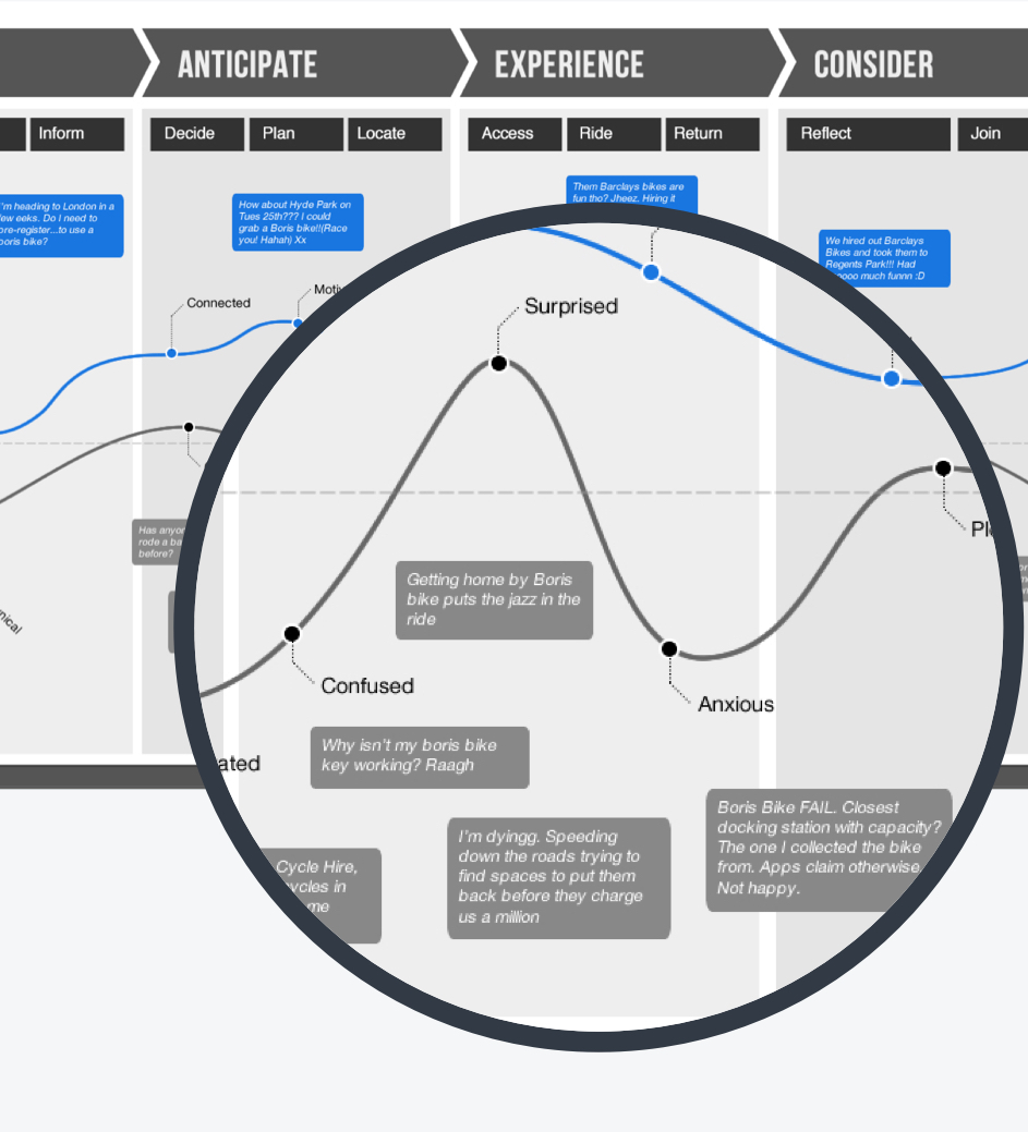
The Vision
A Better London–United by Bike

Whilst our competitors focus on taking the pain out of the scheme, our vision was to help users get more pleasure out of it. We wanted to become an enabler for a better London.
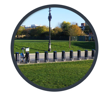
Minimise the Bad
Our key priority for the early phases was to focus on primary user goals. Our first task–stripping the app to its core and focus on usability and convenience.
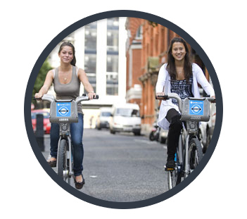
Amplify the Good
Beyond the obvious features, we saw opportunities to build a deep emotional connection with our users. Our vision was to create an honest, human app.
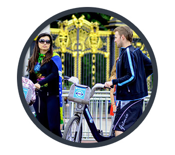
Bring Londoners Together
We envisioned empowering London's city of cycling culture, where cyclists could co‐create safer cycling routes and contribute to the community.
The Requirements
Designing for what users want to know, do & feel
Synthesising goals from our research served as a lens through which we could consider not only what the app should do, but also how it should feel. We believed this would be the difference between delivering a good experience and a great one. Thinking about emotional design early on helped our client understand the importance of aesthetics and tone of voice to the experience.
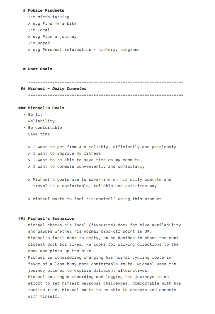
Storytelling About Ideal Experiences
Knowing who exactly I was designing for allowed me to ask myself how the app fits into the lives of the users. I imagined ideal experiences and focused on how our personas think and behave rather than getting into specifics about interfaces, technologies or business goals.
Keeping the scenarios at a high‐level allowed us to work fluidly and explore concepts that we could easily communicate with our team and client. They formed the backbone of our requirements, and allowed us to express these from both a functional and emotional perspective allowing for further empathy with our users.
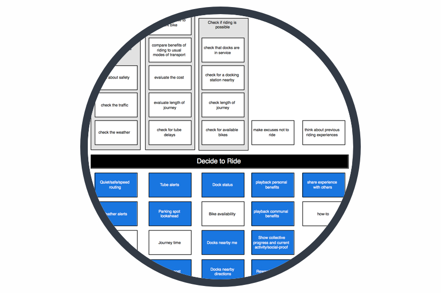
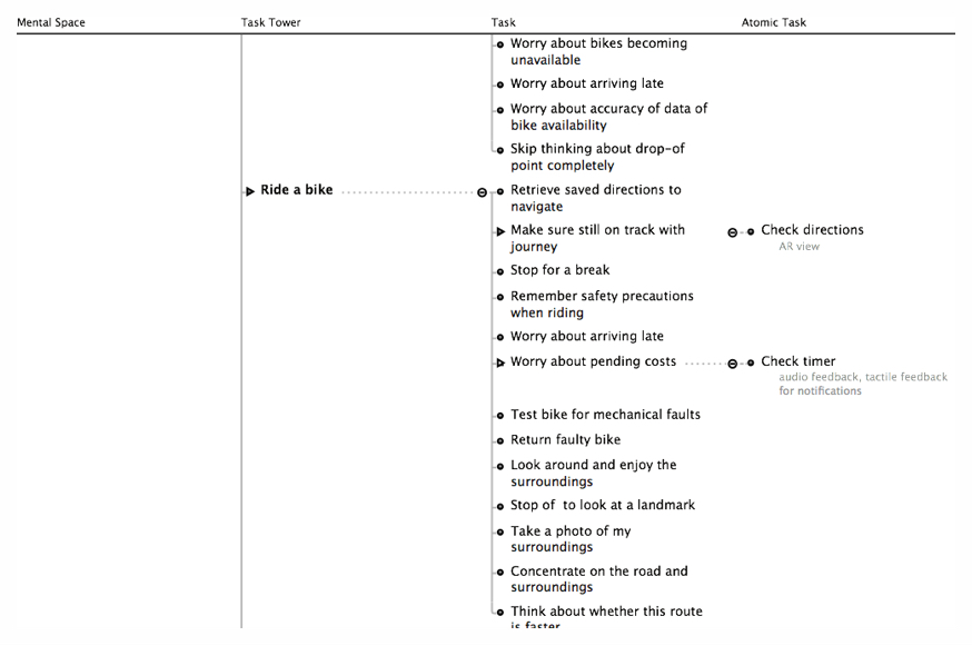
Extracting Requirements with Mental Models
Combing through our research and brainstorming the different things people do before, during and after riding allowed me to come up with a broad set of tasks–quickly. I categorised and segmented the tasks into behavioural affinities and aligned content and features. This gave me a way to visualise what existing functionality and content would be useful, what tasks needed supporting, what opportunities were available to innovate and also what could be discarded from the existing app.
Afterwards, I entered all the ideas into a spreadsheet and prioritised them against our personas needs, tech feasibility, and business objectives. This informed our phasing strategy for the app, the product feature roadmap and the product backlog.
Brand and Experience Requirements
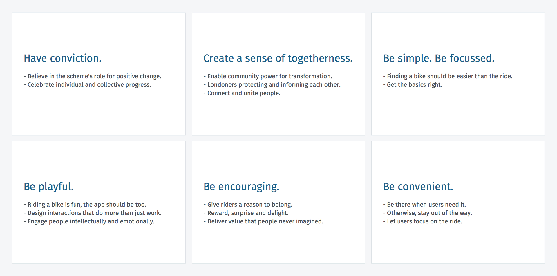
Understanding the usage contexts of the app helped me develop a clear vision of the tonal expectations of our users. To communicate the personality of our app to our client and team, we developed a set of experience principles. These were used to sense‐check design decisions, articulate core values and describe key attributes the app experience should uphold for both the users and the brand. The principles were used constantly to drive the aesthetic, feel and overall tonal direction of the app.
The Framework
Setting the Design Direction
We took a top‐down approach to defining the overall structure of the experience. Sketching and storyboarding, I generated stacks of ideas about the arrangement of UI, functional and data elements, and interactive behaviours. Starting broad, our vision began evolving into something tangible. A high‐level design language, interactions and the app's anatomy began to piece together.

On Track and In Sync
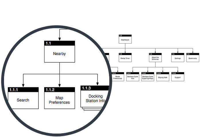
Once our client approved the content and functionality to roll‐out in the app, I could start to structure that content. I used Jesse James Garrett's Visual Vocabulary to represent the architecture of the app. Adopting a numbering system early was beneficial helping our team stay in sync.
Structuring the experience
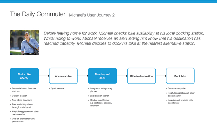
After identifying the main 'plot‐points' in our scenarios, I defined the primary pathways our personas would explore through the app. Crafting several key user journeys for each of our personas, was the best way to conceptualise and structure the proposed content and functionality. I began to think about particular usage contexts, the opportunities they present and how elements manifesting themselves in the interface would help to support the user.
I storyboarded my ideas to help design and communicate more complex interactions and flows. This was a huge time‐saver and allowed me to avoid prototyping edge cases.
The Interaction Framework
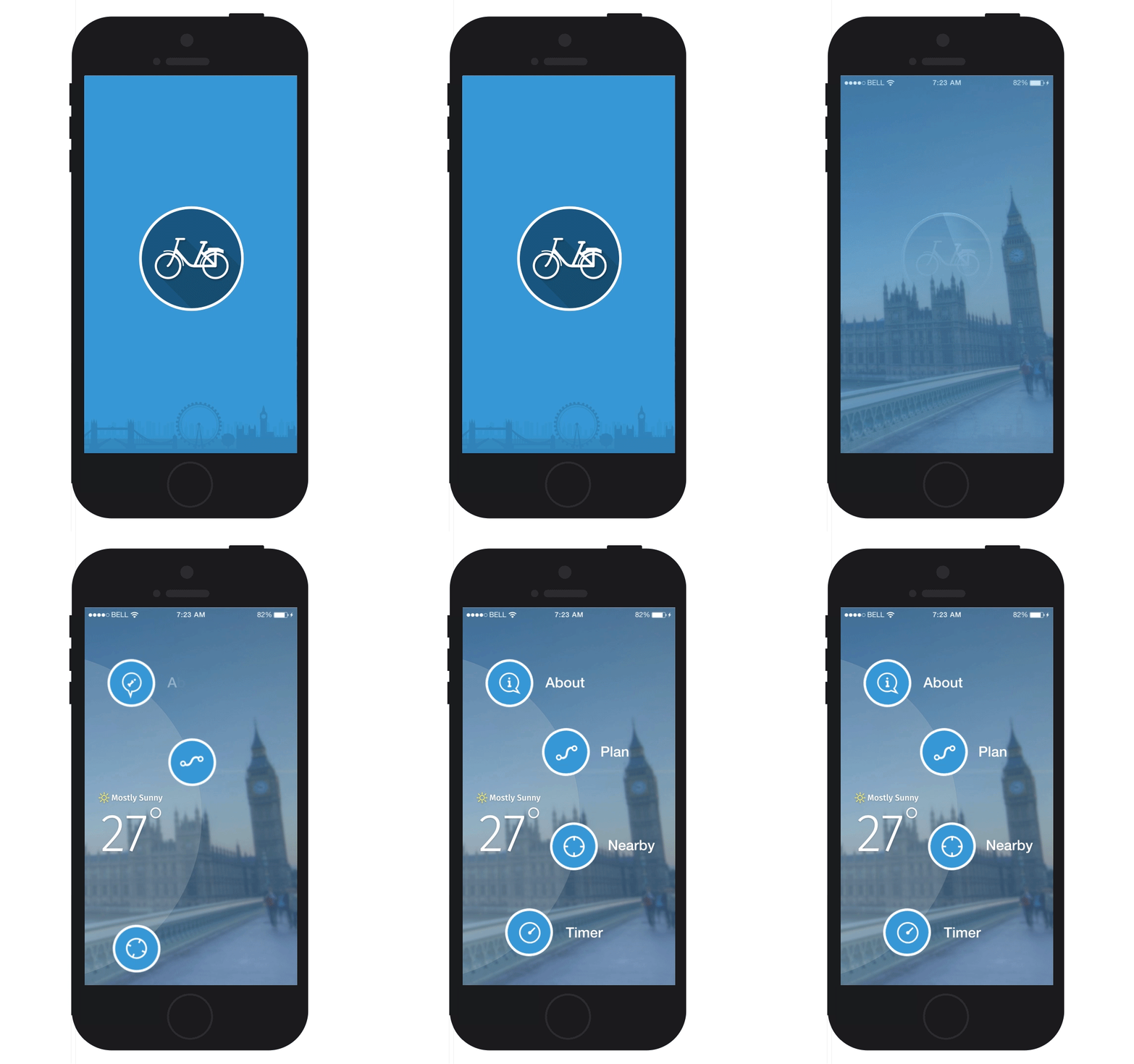
Because of some limitations in Axure, I decided to use Apple's Keynote to communicate the app's interactions and transitions. The transitions in the app were chosen to strike a balance between reinforcing context and creating an engaging and compelling interface. Because Keynote offers all the native iOS transitions, it was the perfect tool at my disposal.
Unfortunately, much of the interaction design work didn't make it into the app because it was considered 'cosmetic' and consequently de‐prioritised. Although I was quite vocal about the importance of transitions in helping the user maintain context while navigating and increasing the perceived performance, they were only re‐prioritised after Usability Testing. A little too late to make it into the phase 1 release.
“In hindsight, we should've found a better way to communicate revisions and let the prototype, be a prototype.”
Mobile Prototyping with Axure RP
Axure proved to be the best tool of choice for prototyping. Because of tight timelines we chose to develop a high‐fidelity prototype which had both benefits and drawbacks. On a positive note, the prototype was a powerful tool in creating transparency in our design process. Our what you see is what you get approach strengthened our relationship with our client and allowed us to gain feedback and approval from both our client and development partner early on.
On the flipside, the prototype was our final deliverable to our development partner. This meant that any design amendments needed to be reflected in the prototype itself. Luckily, Axure has the ability to create masters for reusable page components. When we iterated the visual design, I could swap the assets and the change would be reflected in every instance in the prototype. In hindsight, we should've found a better way to communicate revisions and let the prototype, be a prototype.
Detailed Design
Introducing … London By Bike
The gallery below shows the final iOS app for launch.
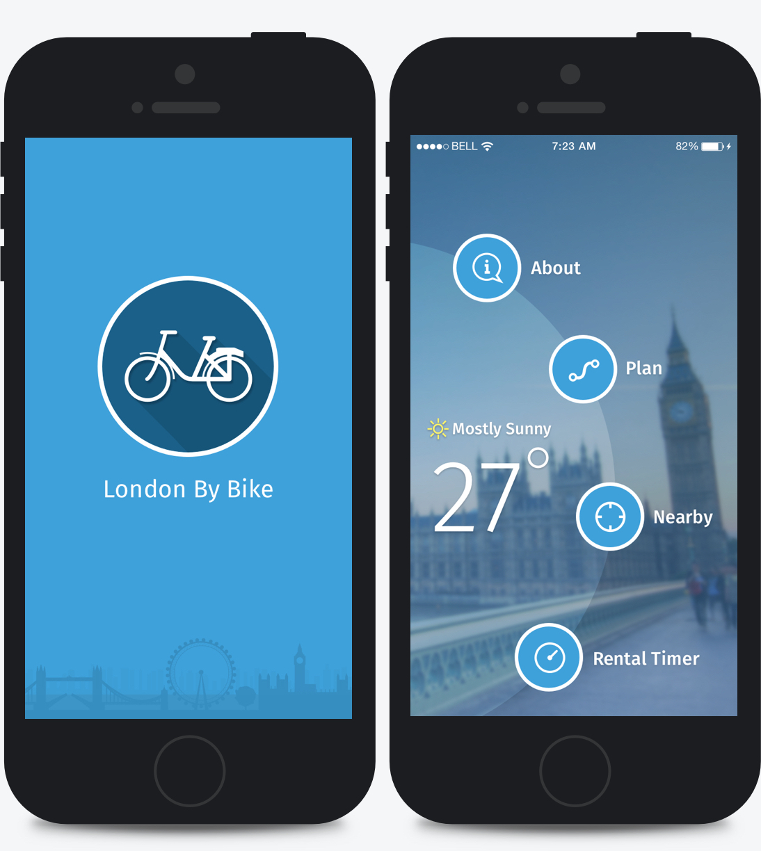
Make important things fast
The main screen has been designed to allow users quick access to primary functions of the application. The size of the icons make tapping easier, the order of the icons are based on ease of reach and the layout was chosen to provide a way for the design to scale for future releases.
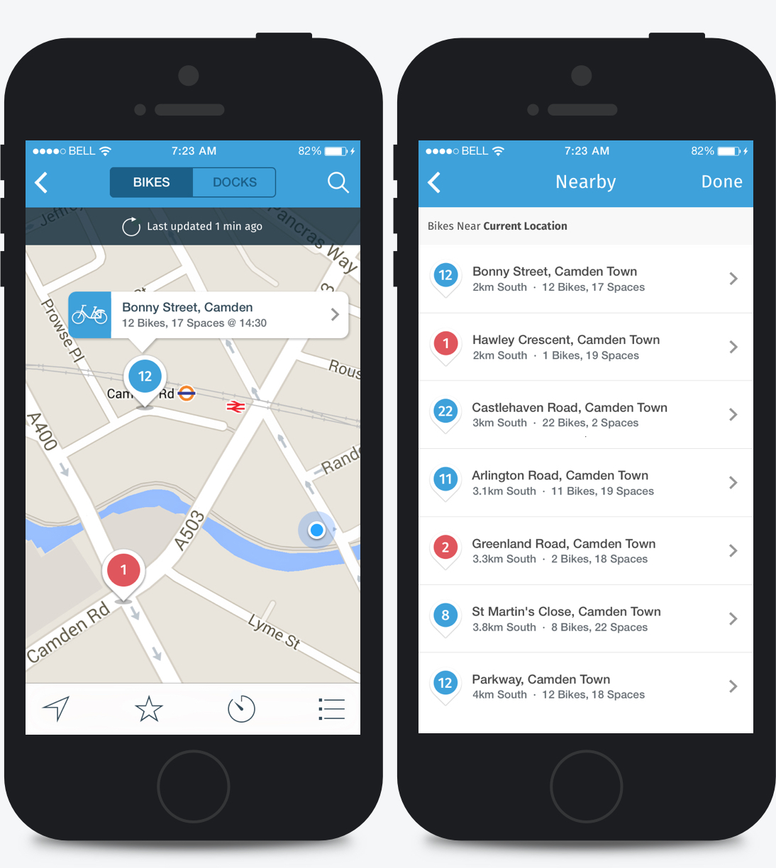
Minimise learning
Primarily designed to support people on-the-go, users can depend on their prior experience with Google Maps and existing iOS design conventions to help them learn to use the app.
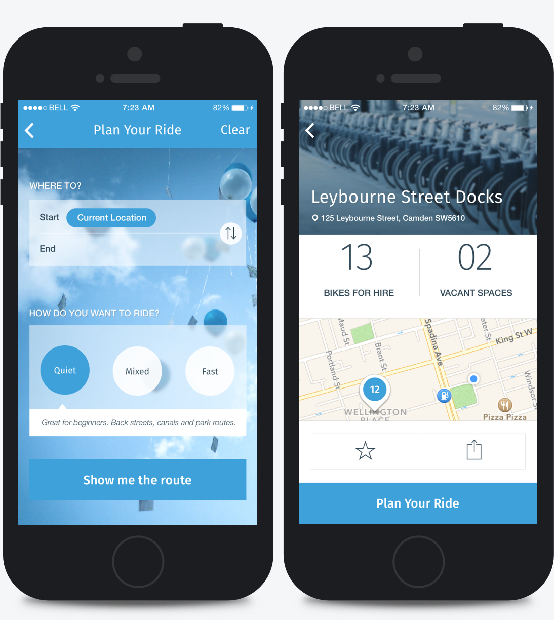
Is it good for me, or is it bad for me?
Our app leverages principles of emotional design to inspire users to go for a ride. With concerns about safety and our persona Natalie representing new cyclists, aspirational imagery is used on pages where our users may be considering going for a ride. In doing this, we hoped to amplify the positive aspects of riding and help users focus on good memories, rather than the bad. We want to create a sense of reassurance and let users know they're in safe hands.
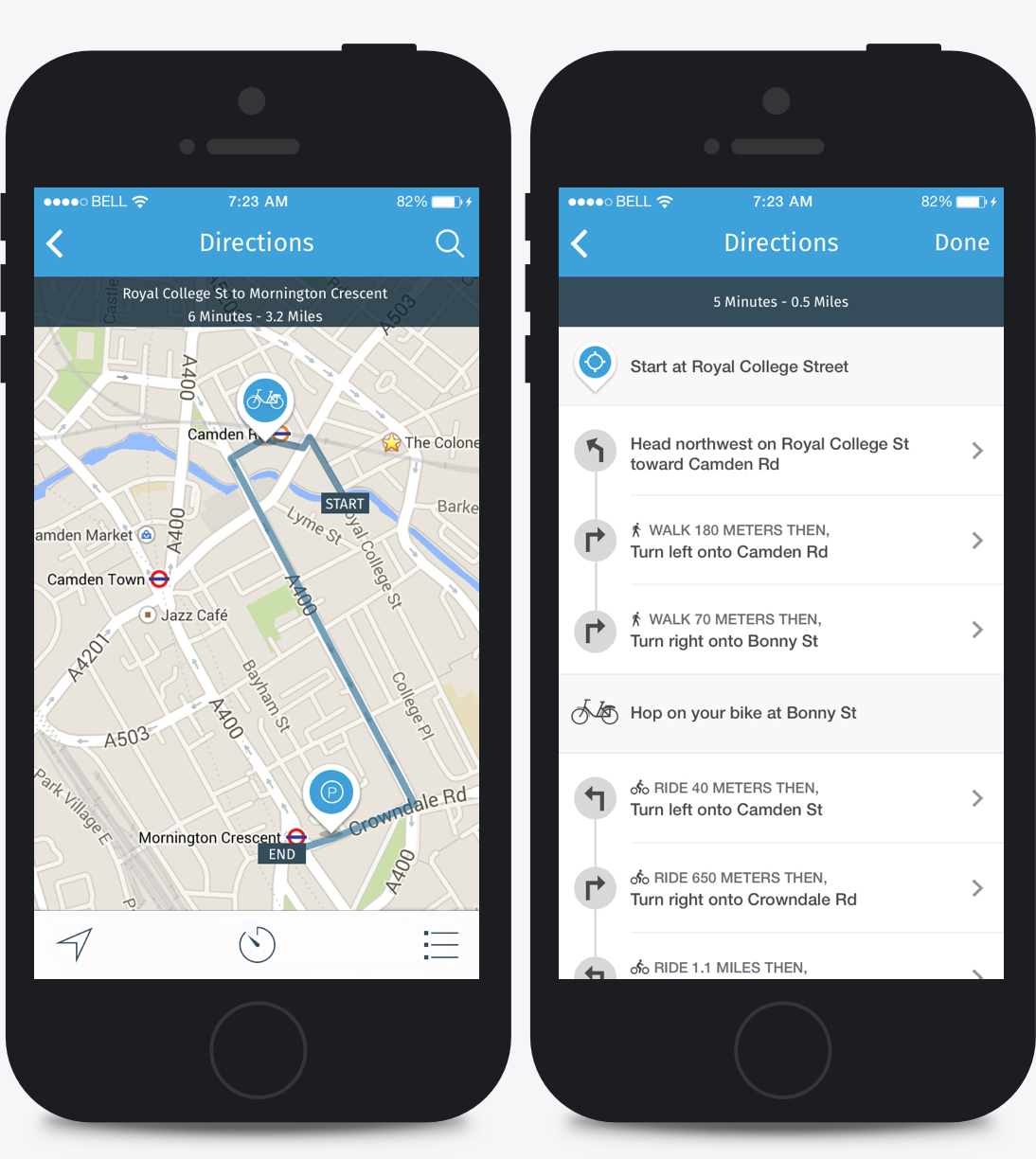
Designed for Confidence
The interface design strives to be confident. It does not contain UI‐bling or unnecessary elements. We opted for clear, readable typography —choosing colours with high contrast to increase legibility in outdoor, low‑light conditions. The design is uncluttered, clean, large and well spaced. All our design decisions help to exude a sense of confidence in the design.
The Refinement
Testing With Users
We worked closely with our Usability Testing partner Spotless Interactive to help define tasks, establish objectives and evaluate the app.
To ensure the test was realistic, we opted to use a real build of the application. However, this revealed how functionally unstable the app was. Between the times spent recovering from bugs and app crashes we were able to find usability issues related to perceived affordances, layout and search.
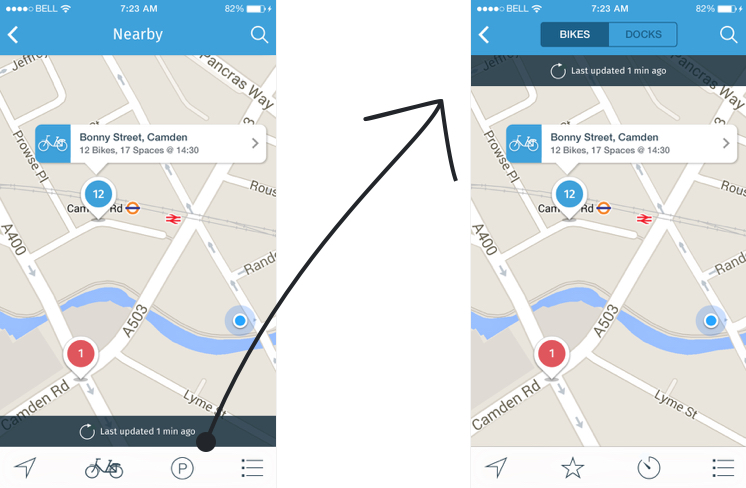
Aiding Understanding of Bikes and Docks
Participants revealed the disconnect between the Bikes and Spaces view controls and the map. Our hypotheses was that using the standard iOS tab bar style did not convey a strong enough perceived affordance and connection to the map.
To aid usability, we decided to use the segmented control platform pattern, which proved to more discoverable and clearer.
Fixing Search
We observed critical issues related to Search which allowed us to re‐prioritise development tasks in the remaining time. Users' search destinations varied greatly—by address, postal code, suburb, tube stations and landmarks. The API we were using was not returning meaningful results which meant users could not complete their task. We changed our API last minute and also added a more personalised feature which indexed recents and favourites.
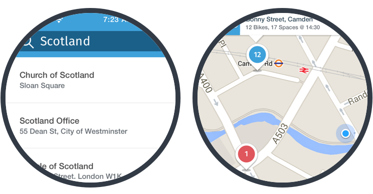
We also observed that users had trouble recognising whether their search was successful and were overwhelmed when looking at the map results. This was because the standard maps behaviour defaults to completely zoomed-out. To help users, we implemented an invisible feature that sets the zoom-level of the map to show 3 results—providing enough context to understand the location and convenience to assess the alternatives nearby.
The Impact
Over 170,000 downloads
The London By Bike app has received both positive and negative feedback since our version 2.0 update. Users have responded well to the app's features and the simplistic redesign. Unfortunately, negative feedback largely relates to the timeliness and accuracy of docking station data—issues beyond our control and subject to ongoing improvements.
Riders use the app as often as they use the scheme (median usage: 2 sessions per week)
30% of riders who have ever used the scheme have also used the app
The app has supported 3 million rides around London
Featured as one of the iTunes App Store’s Top 20 free travel apps
Selected by Apple as an ‘Essential Free Travel App’ in the App Store
Great improvements ★★★★ “A must for the london cycler. Even if you re not using the cycle hire scheme you can still benefit from the cycle itineraries on a google maps background that you can't get on the google maps app.”
Good update ★★★★★ “Good update enabling me to quickly get a data refresh, also useful to see the superhighways on the map. Apple maps seem to be ok despite the bad press, nice one...”
Semi-great little app ★★★ “…The route planner is great. It includes all docking stations (with bike/space availability)…I like the timer feature. It tells you how long you have left until they charge you…”
Spaces & cycle info! Amazing ★★★★★ “Up‑to‑date info … including time of date! An application that is simple and excellent!”
An absolute must! ★★★★★ “This app is an absolute must for anyone who uses these bikes. The job it does is simple but so useful - tells you where the docks are around London and how many bikes/spaces are left.”
Essential app for regular users of the scheme ★★★★ “The functionality of this app is a vast improvement on the main TFL website.”
