Amazon Prime Music
2014 was a year of significant transition for Amazon’s Digital music business. On June 12, millions of U.S. Prime members received unlimited access to a million songs at no additional cost.
To comply with my non-disclosure agreement, I have omitted and obfuscated confidential information in this case study. The information in this case study is my own and does not necessarily reflect the views of Amazon.
My Role
I led the design of Prime Music for the Digital Music Store across Kindle Fire, Fire Phone, iOS, Android, Desktop and Web since the outset of the project in July 2013.
Up until July 2015, I led efforts to evolve the service and address customer pain‐points related to the browse and discovery experience.
Customer Insights & Ideation
I partnered with three project managers and one other lead designer to uncover insights and translate concepts into features that address customer behaviours and motivations.
Experience Strategy & Vision
I created frameworks and prototypes to share the vision, design principles and content strategy. This helped to evangelise ideas, gain alignment and drive decision making.
Planning & Scope Definition
I defined the product with my project manager partners. I evangelised customer goals and balanced business goals. I prioritised and negotiated features for launch and beyond.
Oversight & Coordination
I designed across and collaborated with seven platform designers and their PM partners to translate product features for each platform context.
Design Execution & Validation
I designed down on Kindle Fire, Android, iOS and the iOS mobile Digital Music Store. I executed journeys, wireframes, prototypes and design specs.
Leadership
I designed up and presented works to gain buy‐in from executives, senior stakeholders and many other Amazon teams throughout the project lifecycle.
The Challenge
Create Deeper Relationships with Customers
Since 2013, digital music download sales have declined and now a sizable proportion of the music industry’s revenue is made up by on‐demand streaming services. For Amazon, this signaled a rapid change in music consumption habits.
Our challenge was to evolve with customers and enter the highly competitive on‐demand streaming music segment in the U.S.
Prime Music would offer a limited selection of a million songs and catalogue titles (at least six months old), exclusive for Prime members to stream and download. With this new benefit we hoped to create deeper relationships with Amazon customers.

The Approach
Good Fast Cheap
In favor of speed to market, we were tasked to design and build Prime Music within the existing Digital Music Store and Music Library architecture. This tactic was perceived to be advantageous and the least riskiest.
The assumption was simple—millions of customers visit Amazon everyday. Extend the acquire, play, manage conceptual model that customers were familiar with and leverage the existing infrastructure to get to market sooner and cheaper.
This early architectural decision had a major impact on the quality of the customer experience we could both create and reconcile.

Chasing Waterfalls
Feature design and development were broken into parallel workstreams for the Music Library and Digital Music Store. I led the design for all aspects related to the store.
Each feature phase of the project was serialised, starting with the design and development for the reference platform—Kindle Fire. Once each feature was designed and approved, the engineering team began the implementation.
I followed by working with platform designers to translate product features for their platform’s context. Concurrently, I would design the next feature in the pipeline, whilst also working with my own platform engineering teams to execute the current feature through to completion.
“The combination of a fixed launch date and aggressive scope created an intense environment with many coordination and time challenges.”
Working backwards from a fixed launch date, meant that design was subsumed into an engineering‐driven process. Sign‐off milestones were driven by engineering estimates and time to create the right design was the time left over. The combination of a fixed launch date and aggressive scope created an intense environment with many coordination and time challenges.
The Discovery
Customer Insights
We conducted customer and market research to drive our planning phase.
These are the key insights that defined the launch version of the product:

Lean‐back & Lean‐forward
The primary segments are customers that listen to spoon‐fed music and customers that actively control what they listen to.

Playlists Go With Activities
Customers listen to playlists to complement a mood or an activity such as relaxing, working‐out, cleaning or reading.
Songs Remain The Same
Customers only listen to 19% of their own music library which consists mostly of catalogue songs, not albums.

Streaming To Save
Price sensitivity was the motivating factor for customers switching to on-demand streaming services.

Collectors Listen More
Paid‐tier customers invest more into building their libraries and stream music four times as much.

Show me You Know Me
Customers expect Amazon to know them and serve personalised music recommendations.
The Vision
One Million Songs, Free For You
Our vision for Prime Music was to be the best value music service for Amazon customers, not a me‐too on‐demand streaming service.
We did not want to offer an exhaustive catalog of songs, rather wanted to focus on helping customers discover music they’ll love, from a selection of music they will actually listen to.
Our customers expect and trust us to know them. We envisioned the future of the music service to be deeply personalised to customers' music tastes.
Together with 2‐Day free shipping, unlimited streaming of popular movies and TV shows, access to more than 500,000 free ebooks, and unlimited photo storage—Prime Music would make Amazon Prime one of the best deals in the history of shopping.
Value is what we wanted customers to shout about.
The Service
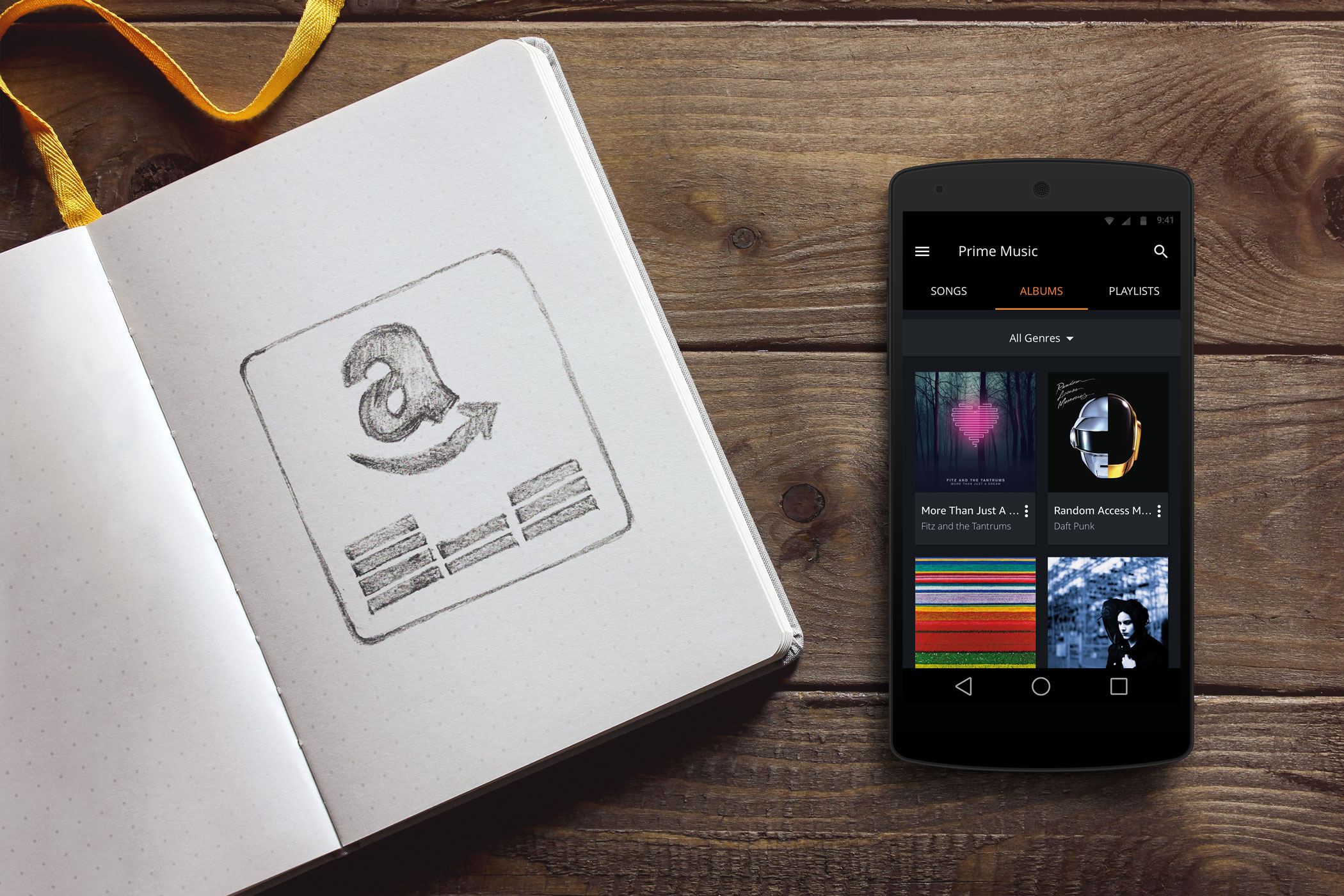
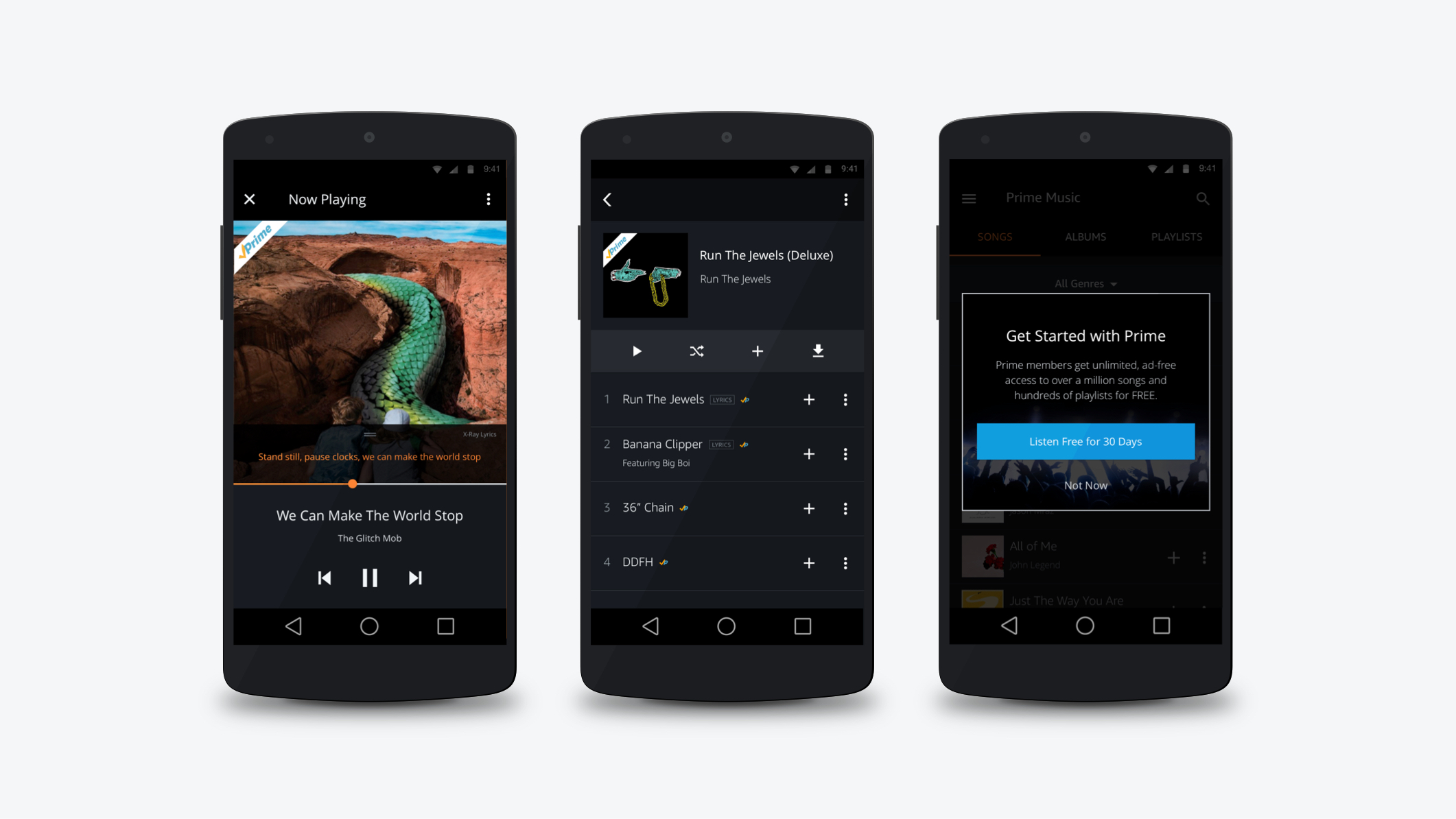
Introducing Prime Music
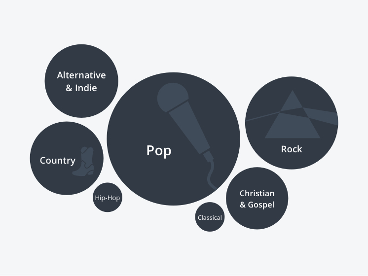
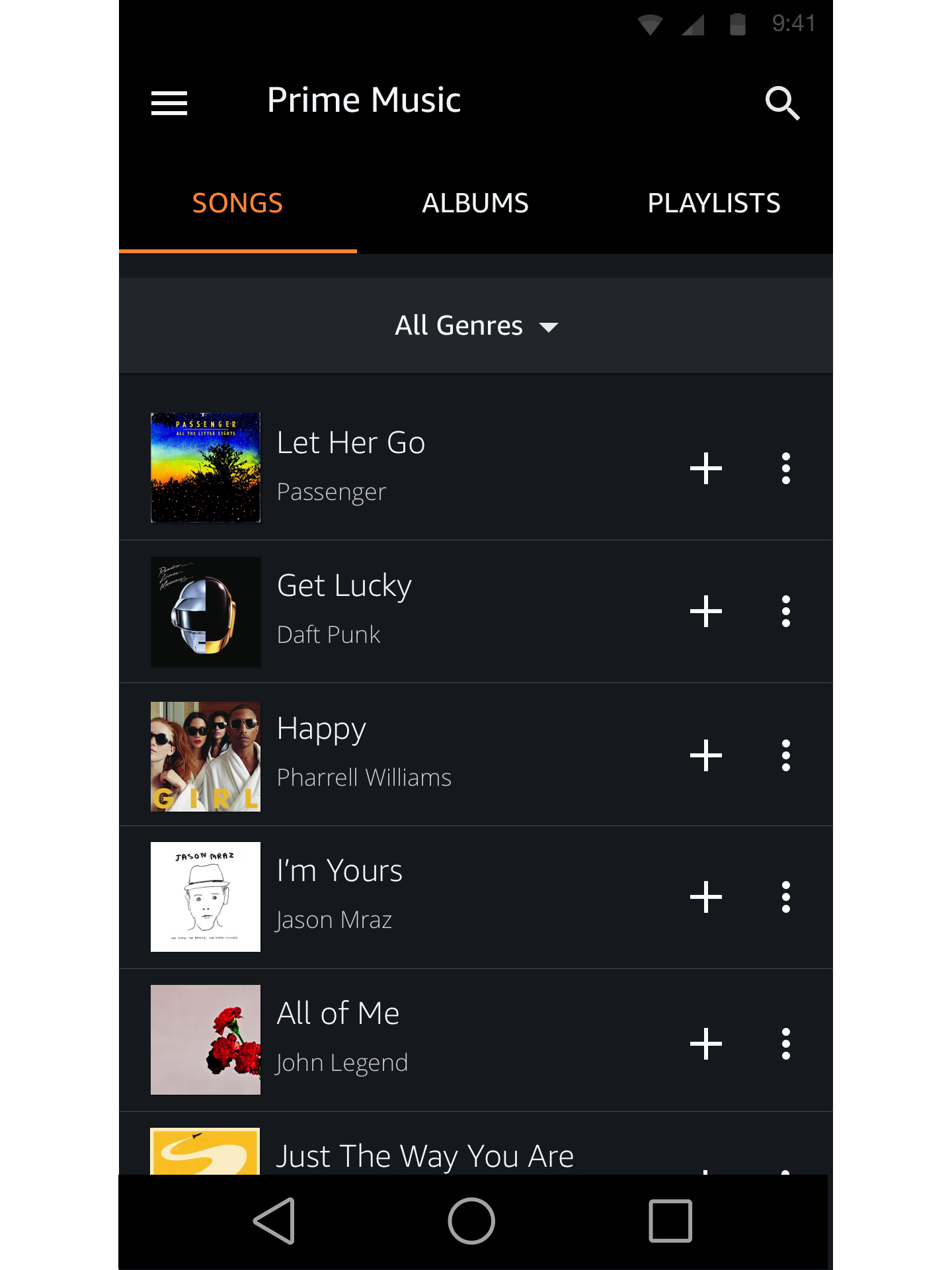
Amazon Prime Music is a streaming music service available to Amazon Prime members at no additional cost to their membership. Prime members can listen and download from a catalogue of over one million songs, hundreds of curated playlists and personalised ad‐free stations.
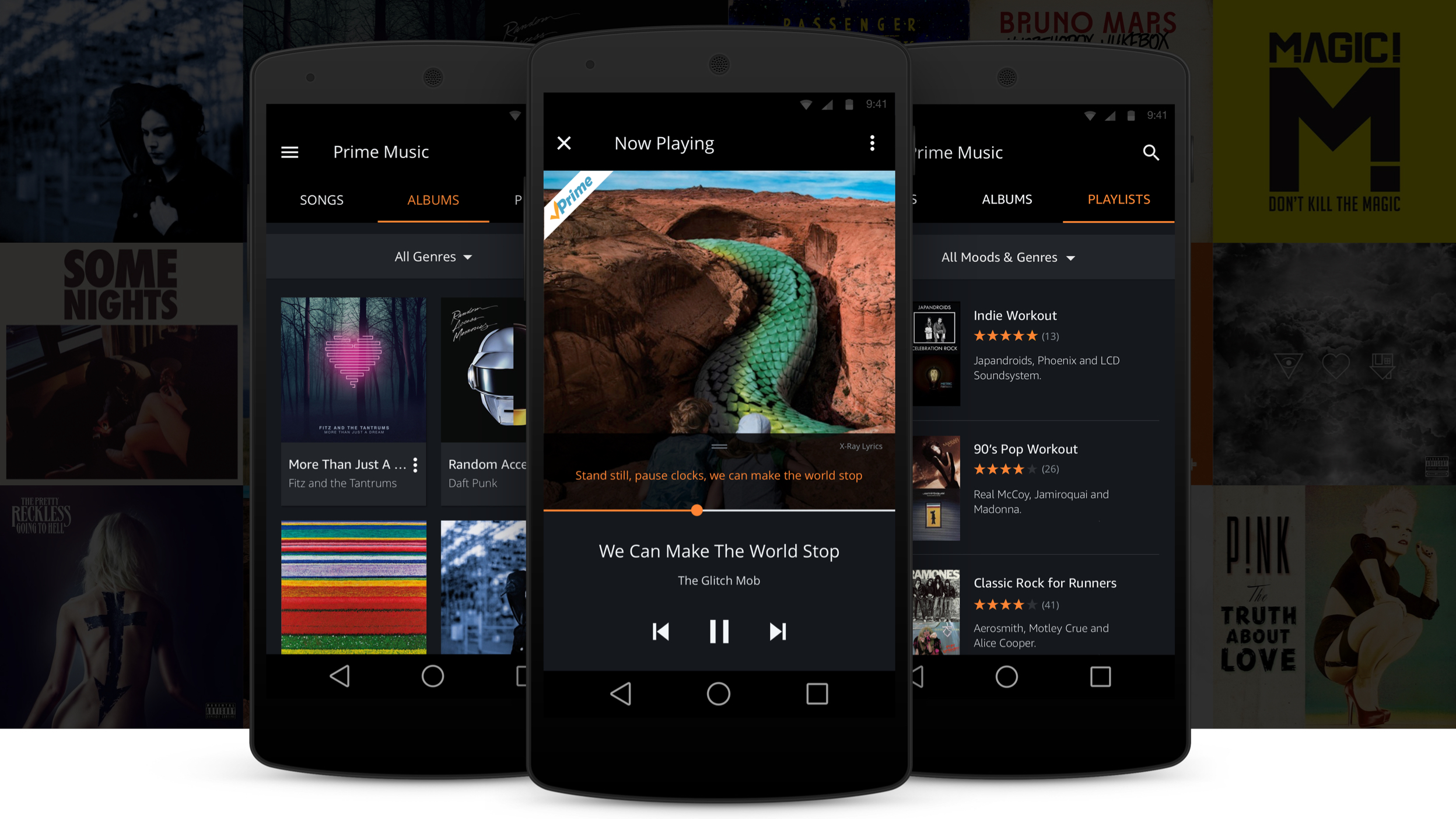
Turbocharge your library
Customers can add any Prime‐eligible song, album or playlist to their music library to stream, take offline or mix with their own personal music collection.
Complete your albums
Customers who have previously purchased songs (through Amazon or elsewhere) that are part of a Prime‐eligible album can find the remaining tracks to collect or play directly from their own library.
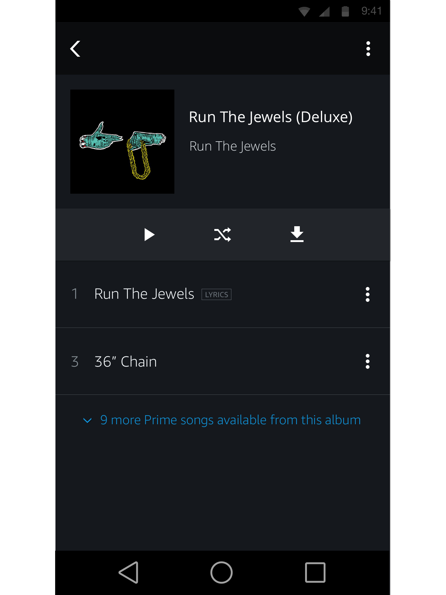
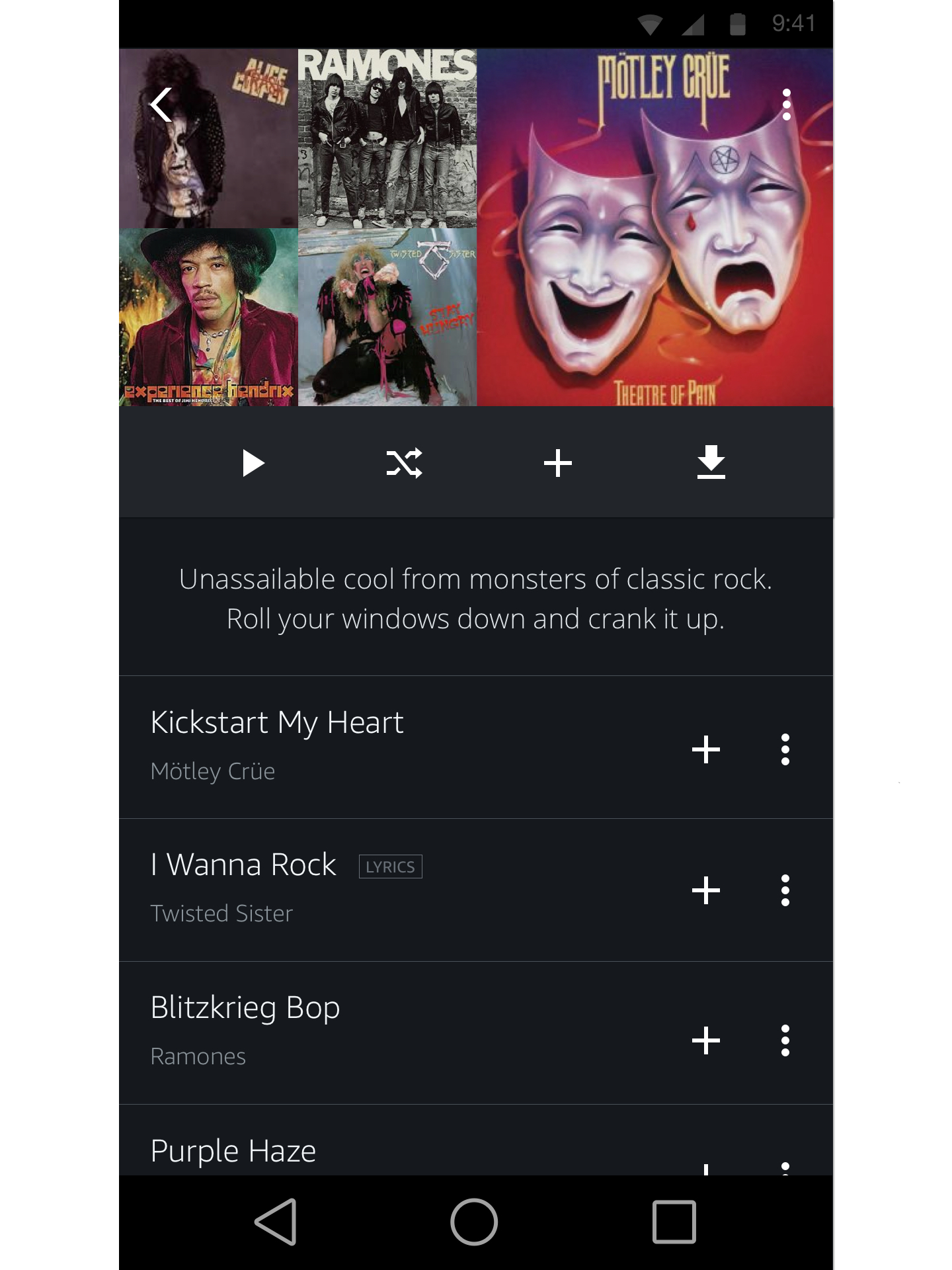
Playlists For Every Moment
Prime Playlists are a curated music experience for moods and activities—built by Amazon’s team of music experts. Prime Playlists take the work out of finding and managing music, so customers can spend more time enjoying it.
The Framework
How We Got There
The biggest challenge I faced throughout this project was balancing moving forward with designs, whilst collaborating with the wider team. Since this project touched every part of our music business, I needed to coordinate and get buy‐in from many teams that were both co‐located and distributed. This was hard.
Managing feedback was even more challenging because it felt like a swinging pendulum of viewpoints. The team spent a disproportional amount of time debating design decisions— when there wasn’t data that could easily be gathered to help drive a decision.
The impact was agony, paralysis and a growing skepticism for instincts in the design process.
“Managing feedback was even more challenging and felt like a swinging pendulum of viewpoints.”
I observed this pattern early enough in the project and invested time into creating documentation to help alleviate the data crutch and better articulate and distribute design rationale. Doing this upfront was quite time consuming, but saved a lot of back‐and‐forth as the project progressed.
Design principles and the content prioritisation framework helped to create visibility into my decision‐making process and galvanise the team to share in the vision.
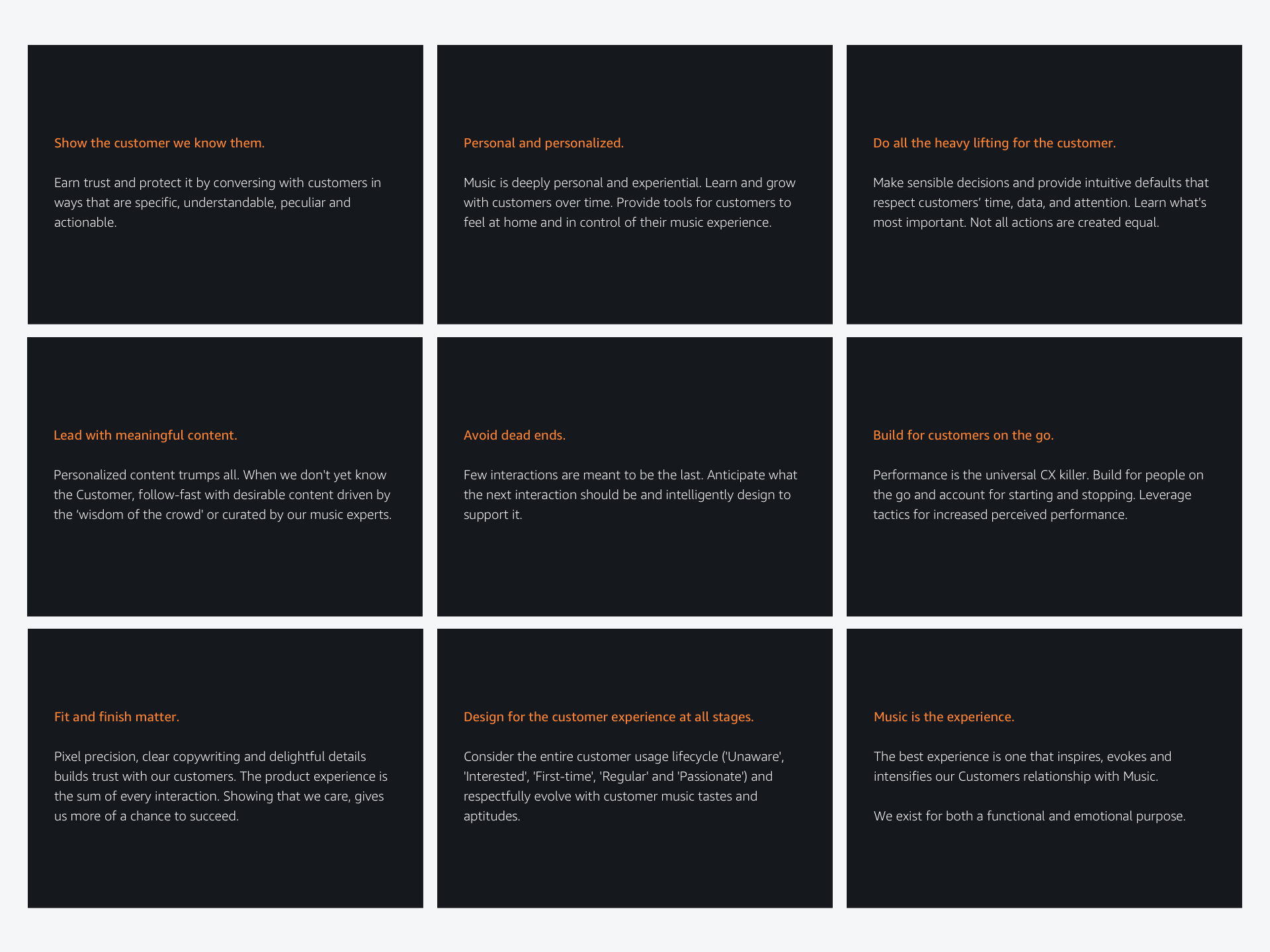
Content First
My earliest design challenge was to propose how we would display content in our Digital Music Store for both Prime and non‐Prime customers.
I hypothesised that the priority of Prime‐eligible content would be different if a customer did not have a high intent to purchase. I did not have qualitative data to support this and subsequently performed a hierarchical card sort with eight participants. My aims were to understand how customers thought about different categories of content and what was most important to them in the context of Prime.
During the think‐aloud I was surprised to hear participants ranked content based on what they felt was predictable and could trust as relevant, what made them curious and finally what they were skeptical about.
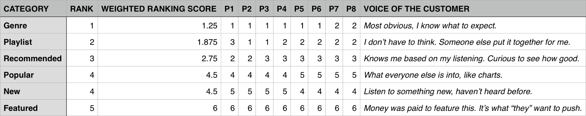
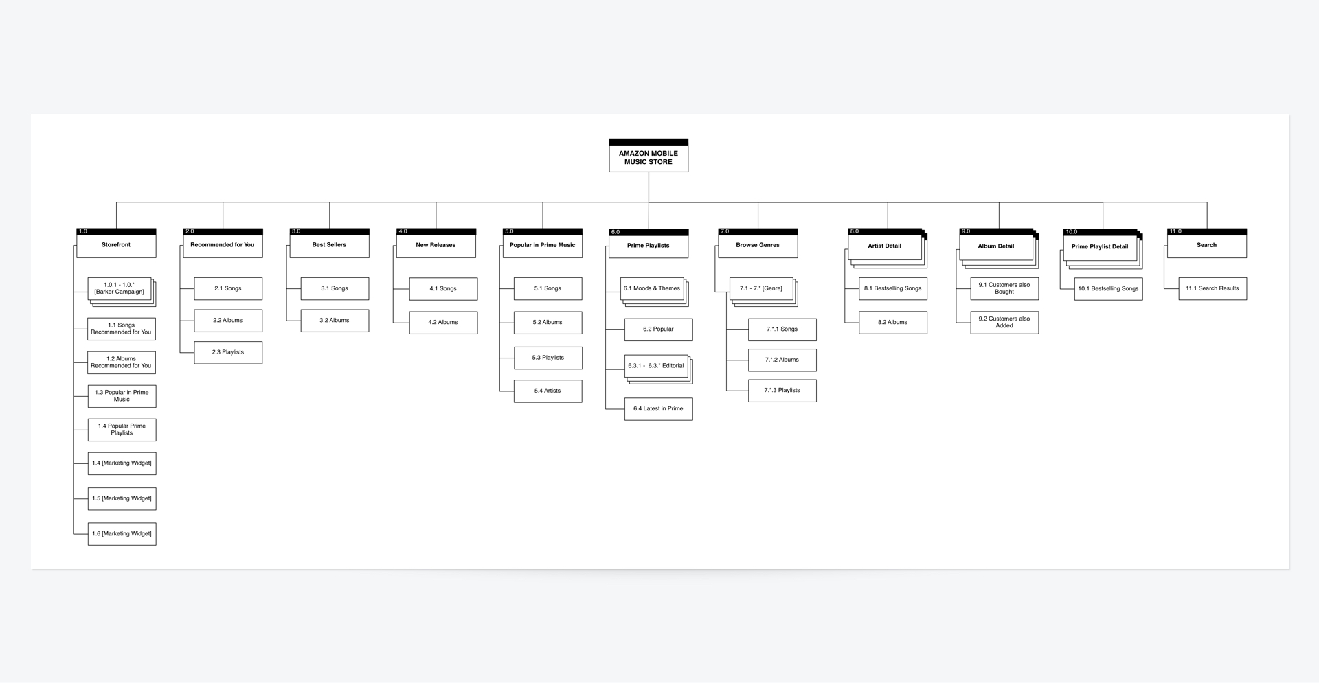
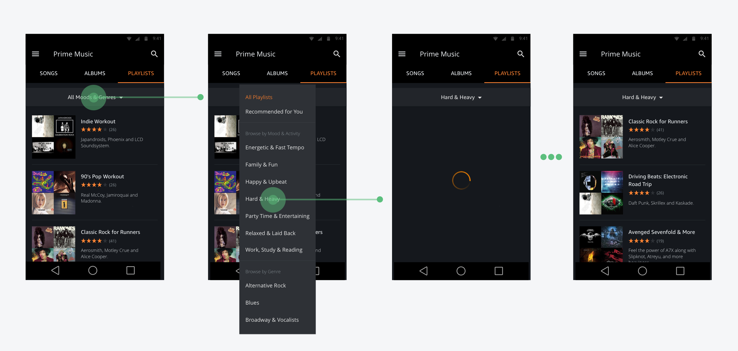
The results highlighted that we needed to prioritise playlist content and that genres was a familiar tool for customers to browse content. I combined these two concepts to design the Prime Playlist browse experience. I then coupled the category ranking with feasibility scores to create the rest of the browse structure.
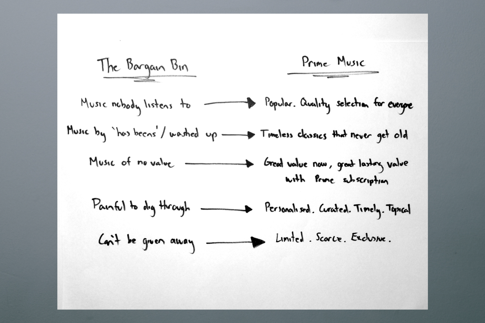
Dreams of the Bargain Bin
A technique I used to brainstorm content ideas was inspired by a technique from Marty Neumeier's book—“Metaskills: Five Talents for the Robotic Age”. Marty teaches us that great and original ideas can emerge if we reverse the polarity in an assumption.
I imagined the worst possible perception of Prime Music to be analogous to the bargain bin in a brick and mortar music store—discounted music that nobody wanted. Through this lens, I identified the undesirable traits of the bargain bin to help articulate (opposite) principles for planning and creating content.
From this exercise, it became clear that we could help customers derive more value from the service if we crafted a story behind the music.
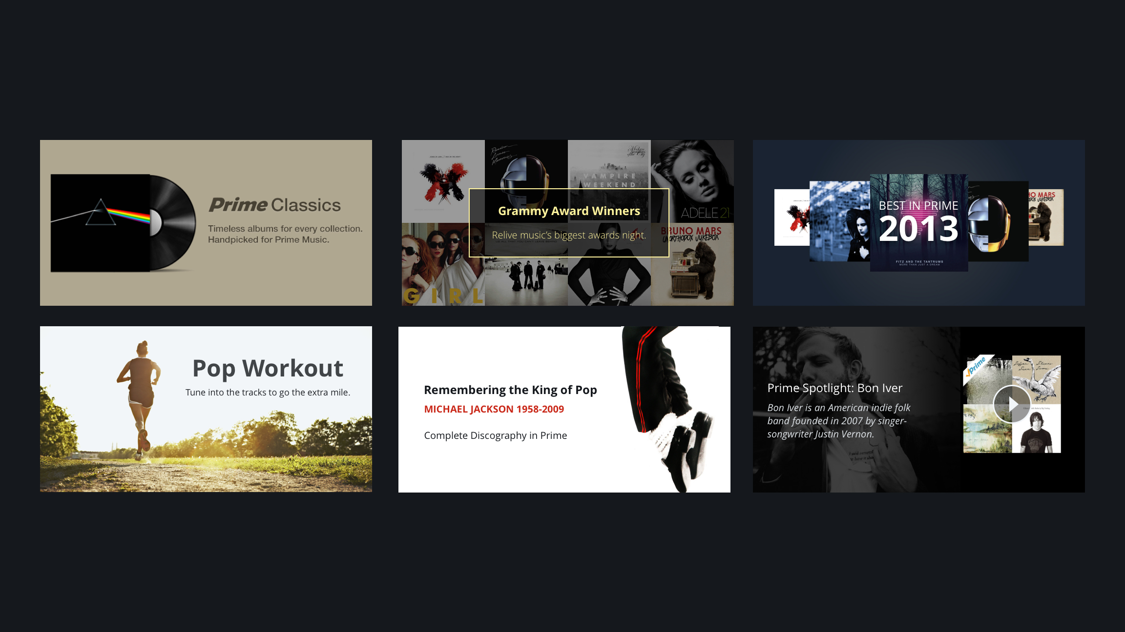
To gain buy‐in for this direction, I created a set of campaign composites. Although many of these concepts were not feasible at the time of launch, they were still important to help get the team excited about the future.

Moody Listening
We conducted a large‐scale survey to understand how casual music listeners identify with and select different types of playlists. We learned that:
- Genre and mood were the most important influencers when choosing music to listen to. Activity was also reported.
- Genre is used as a way to find music that matches a mood, or to exclude certain types of music.
- There is a high degree of overlap in the way customers think about moods and genres.
Based on these insights, I designed the Prime Playlist browse experience as a single filter list. This was designed to reduce upfront decision‐making; reduce cognitive load recalling between genre and mood; and carry a stronger information scent to invite customers to use it.
The Everything Store
Embedding Prime Music within the Amazon Digital Music Store presented a novel design challenge, because it needed to work for everyone. I asked myself two questions:
- How was it possible to effectively satisfy both Prime members and purchasing music customers, when they have very different motivations and goals?
- How would we utilise existing design patterns, if they were heavily optimised for selling music?
From the outset of the project the Store + Prime Music direction felt like a bad idea. I knew however, that the decision had been made and I was not in a position to influence it—not at the time anyway.
Rather than think catastrophically, I moved forward by focussing on the strengths of the approach.
After analysing the strengths, it seemed logical to model Prime Music after what customers were already familiar with—discovering and purchasing music from Amazon’s Digital Music Store. Our proposal was to allow Prime members to purchase Prime-eligible music—for free.
The next challenge was to communicate to customers what content was Prime‐eligible and how they could collect and listen to it.
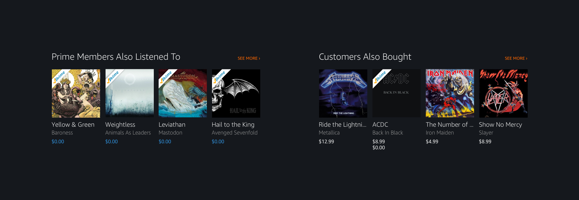
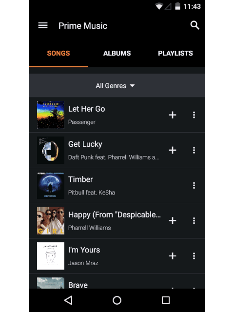
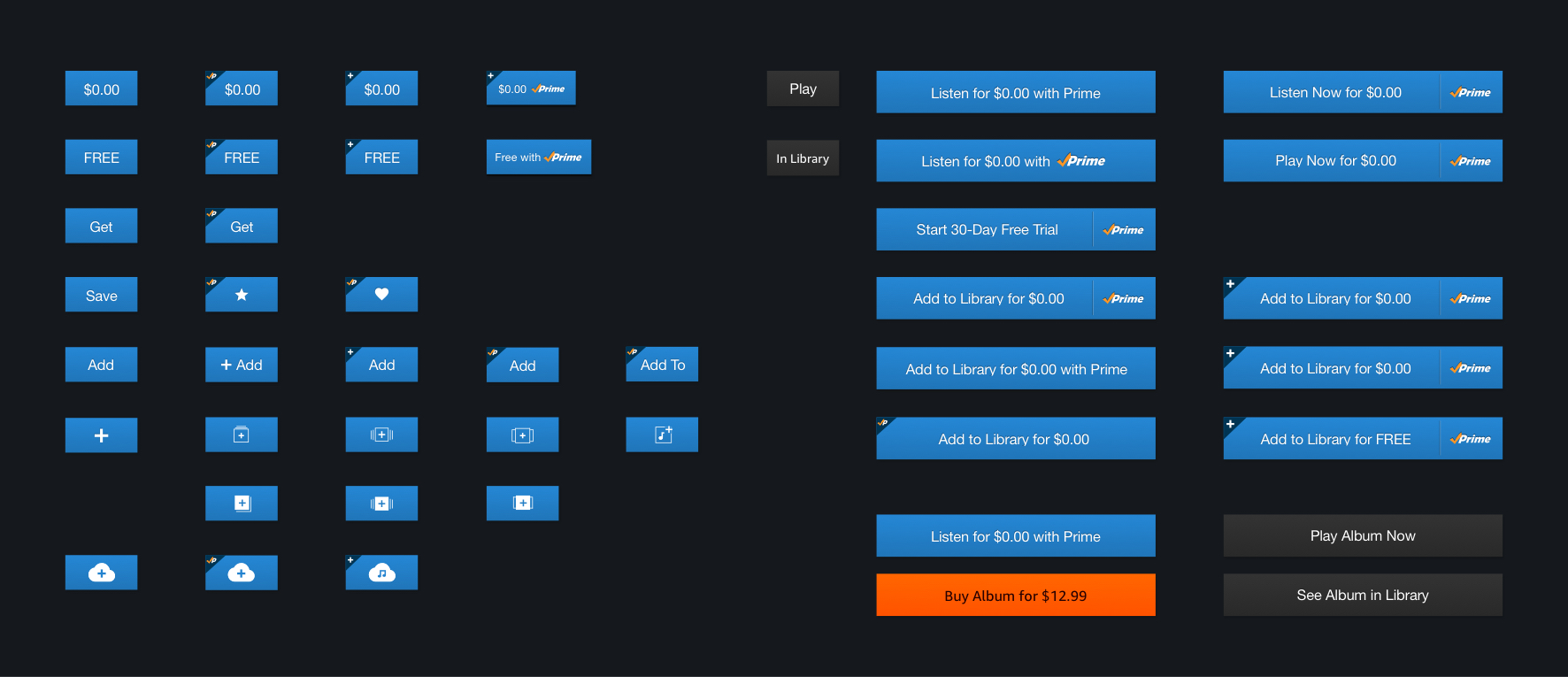
The Controversial Blue Button
This little button was one of the most controversial design decisions for our team. I spent more time defending these design decisions than solving the design problem!
The three areas that were most debated related to:
- what the button said
- what the button looked like
- what the button did when you pressed it
I started my design process with the Think, Do, Feel exercise from Gamestorming. However, rather than using observed behaviours, I worked backwards from the aspirational thoughts, feelings and actions I was designing for.
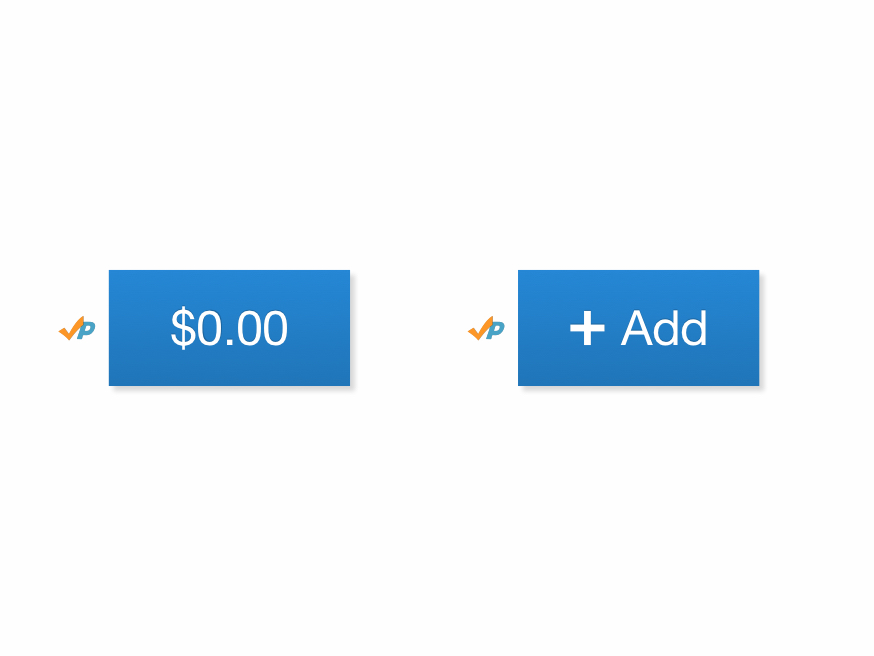
After weighing up the strengths and weaknesses of my explorations, I narrowed down to two competing design concepts: $0.00 and +Add. To close on this decision, I put together a plan for user testing.
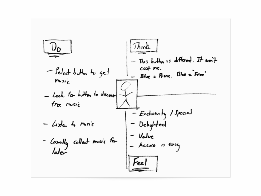
“…I felt good enough to move forward with the $0.00 button design because I knew it would be very easy to pivot, if needed.”
Testing the two button options with 16 participants revealed that:
- Customers were delighted by the blue.
- Customers could identify what content was Prime‐eligible.
- Customers did not understand what +Add meant and thought it would charge them money.
- Customers thought that after selecting $0.00 they would own the music.
This validated most of the aspirational design goals I had conceptualised. I was completely surprised by the confusion of ownership and did not realise how much the context of the Digital Music Store influenced customers perception of our service.
Based on these insights (and a pressure to move on to the next feature), I felt good enough to move forward with the $0.00 button design because I knew it would be very easy to pivot, if needed.
Detailed Design
Communicating Design
Amazon upholds infamously high standards for the work it produces both externally for customers and internally for team members to consume.
This has created a culture which seeks to earn trust through accountability, diving deep into the details and inviting others to scrutinise work. Heavy documentation is the artifact of such a culture.
The sheer size of this project and structured waterfall approach meant that I needed to have everything figured out before teams would commit to moving forward with the work. Many teams involved in the project needed to see it in a tangible document. This risk averse mindset meant I created a lot of reference documentation that was widely distributed and a high overhead to maintain.
“Prototyping was the most effective way to gain meaningful feedback…”
For each feature phase, I went through cycles of requirements, consensus, approvals, detailed specs and handoffs.
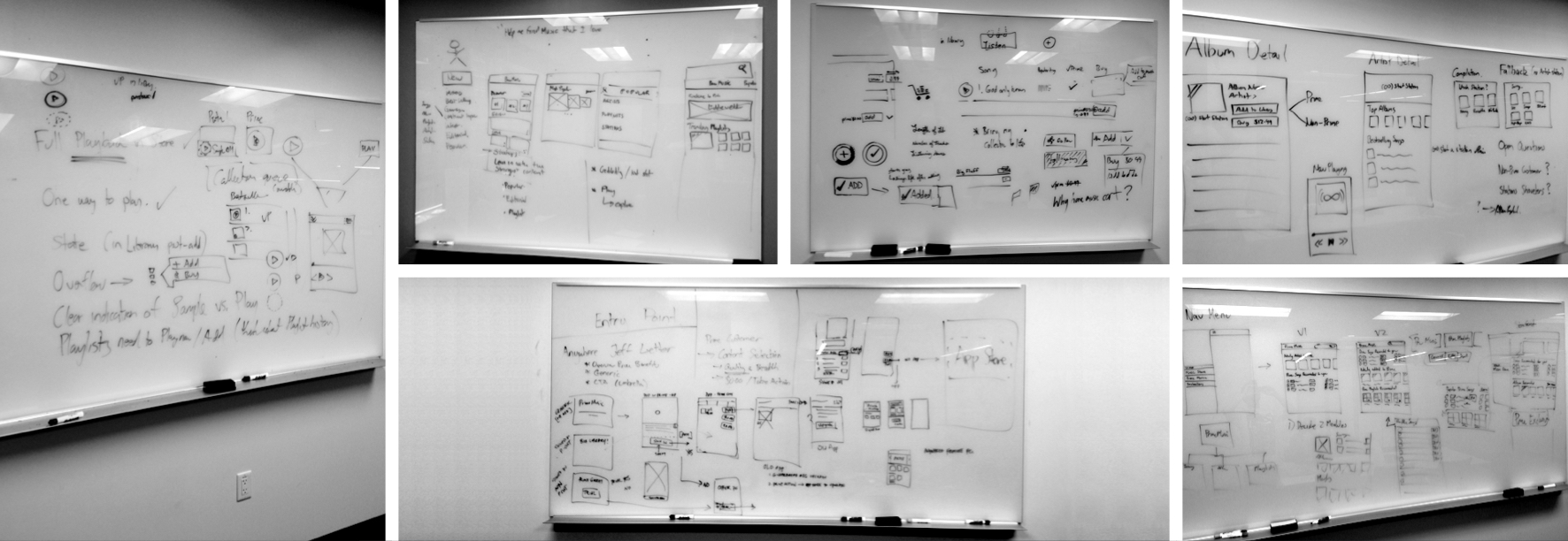
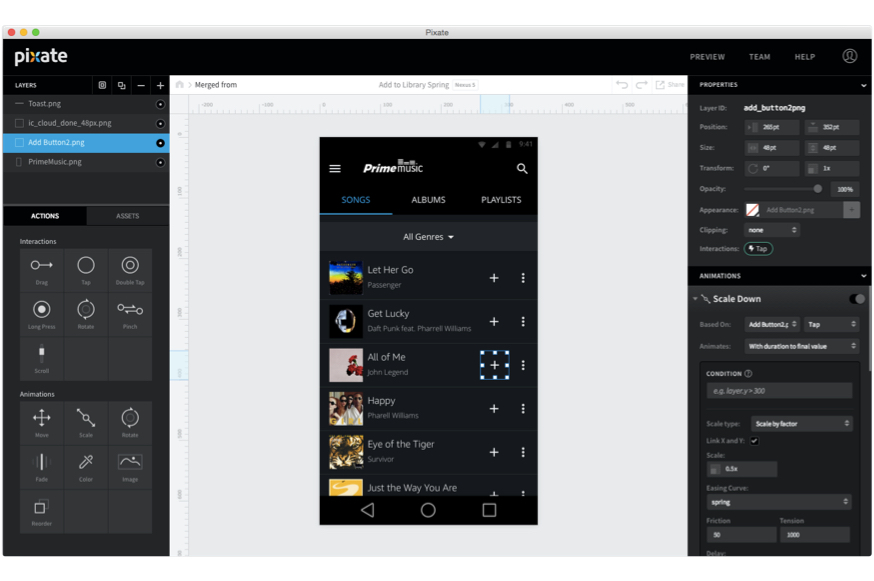
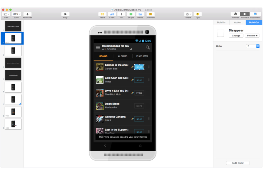
My process involved sketching and white‐boarding concepts and flows with my PM partner and then translating these directly into hi‐fidelity design comps. Since I was working with many existing design patterns, it was relatively easy to move straight into hi‐fidelity designs.
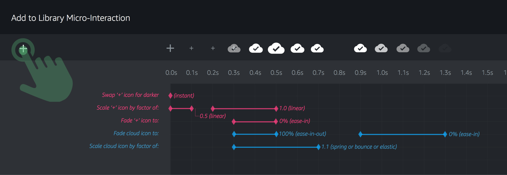
My next step involved slicing the comps and piecing them together with Keynote or InVision into a prototype. In the early stages I focussed only on representing the highest risk areas of the design. Later phases allowed me to focus on micro‐interactions, which I created in Pixate and Keynote.
Prototyping was the most effective way to gain meaningful feedback from the team, consensus from stakeholders and approval from senior leadership. I was able to easily distribute these as videos and recycle them for Usability Testing.
Detailed Specs
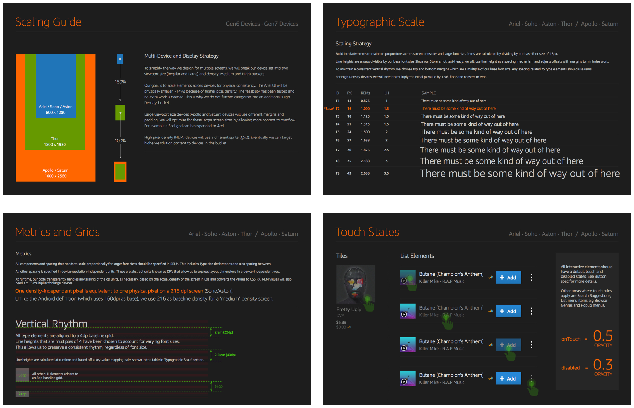
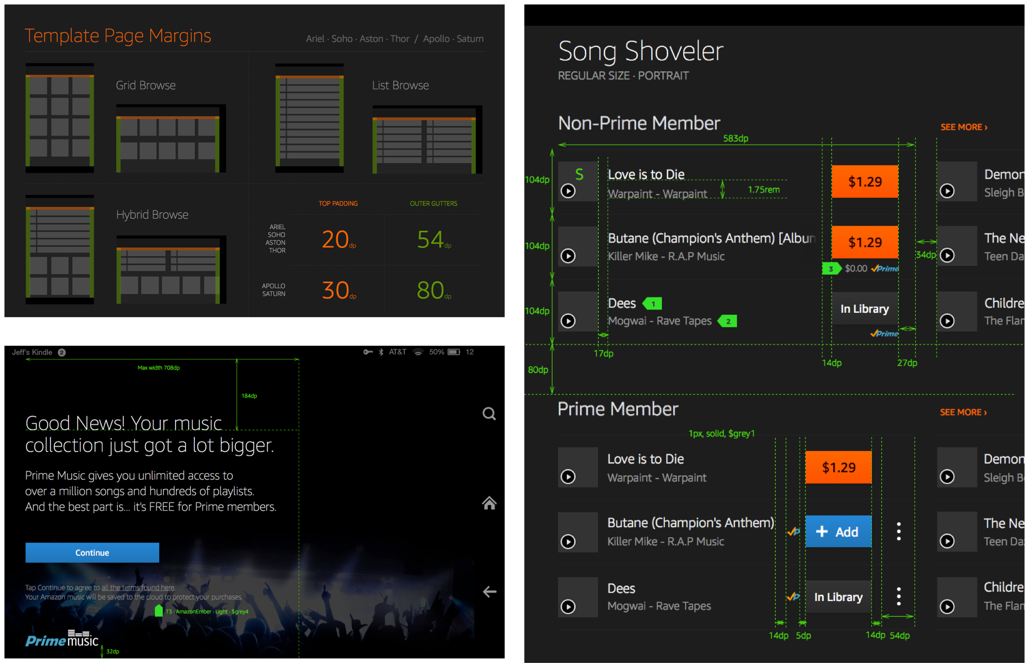
I created six sets (two for each platform that I owned) of documentation during this project to communicate requirements to the engineering team and support our quality assurance teams in writing test cases.
These deliverables consisted of the CX Spec—requirements and customer journeys and the Visual Design Spec & Keylines—the design system.
This documentation required the most rework during the project and was the highest overhead to maintain.
I also experimented and came up with complementary documentation to communicate animation and timing keyframes for our micro‐interactions.
The Execution
Bringing It All To Life
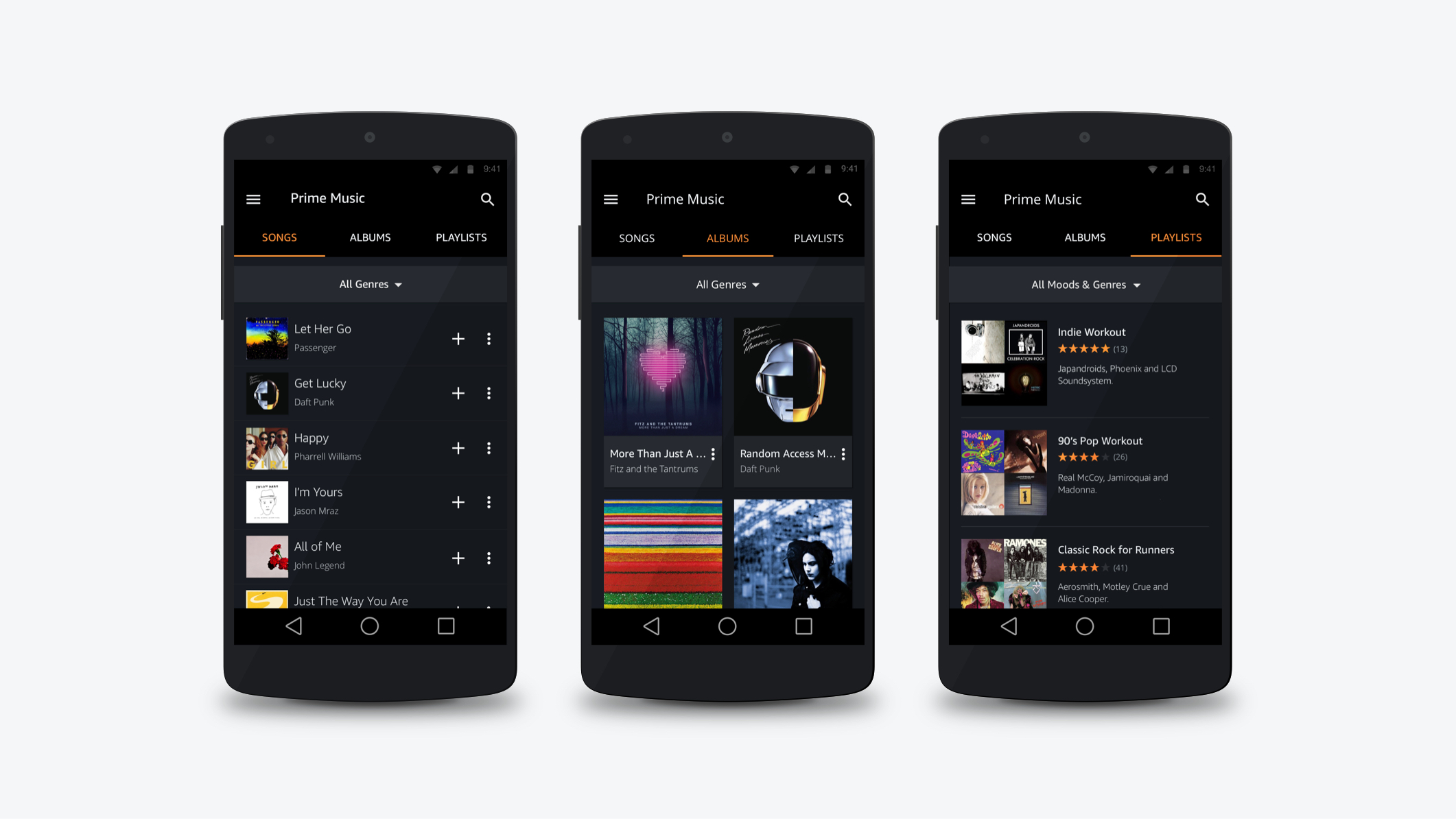
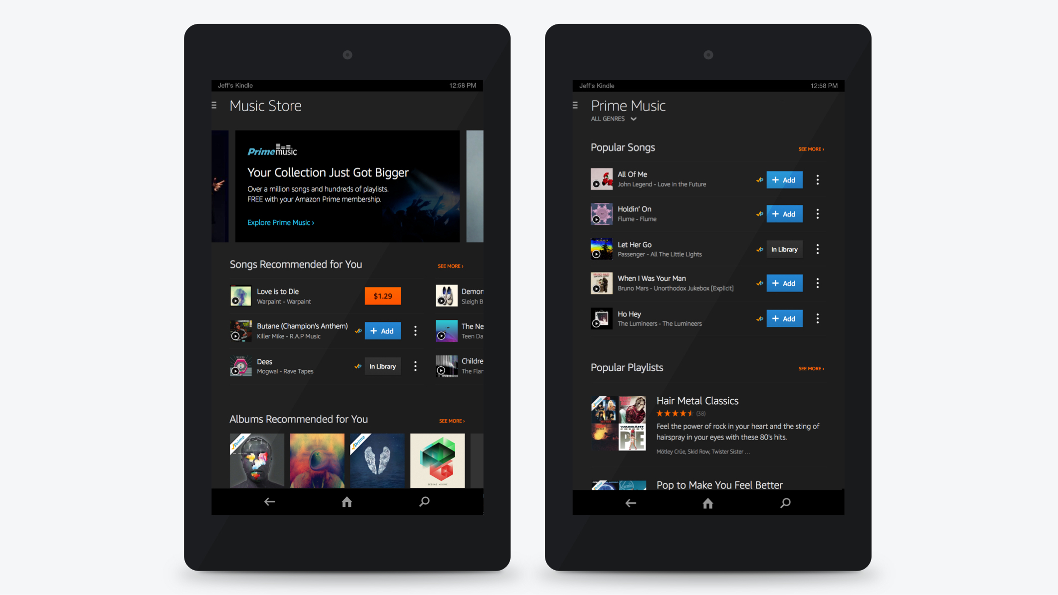
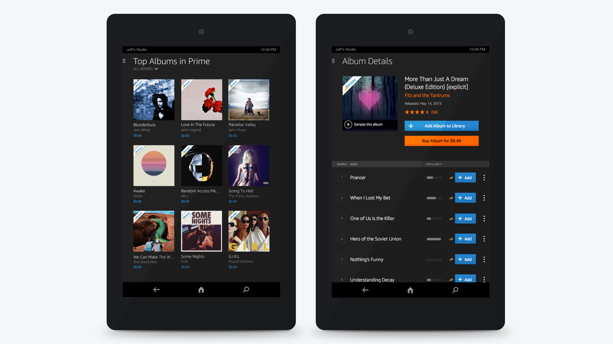
The gallery below shows some of the app designs for Kindle Fire and Android Mobile.
Validation
Testing Our Assumptions
Once the team had a prototype ready for use, we knew we needed to put it in the hands of our customers.
2 months before launch we doubled‐down on validating our wildest convictions. We held an extended beta and conducted Guerrilla user testing which highlighted the top risks in the product to be:
- Playback quality, performance and stability
- Wayfinding
- Playing and collecting music
Interestingly, the themes we discovered during this time were the same issues we discovered after launch.
The Refinement
Last Minute Pivots
The product team divided into smaller teams to investigate the top categories for customer feedback and develop a proposal to address the top risks by launch.
Playback Quality and Performance
Customers indicated that streaming Prime content took too long to start playback and Prime music would often just stop. This was a sobering moment for the entire team. We had been so focussed on the design of the product and at this point it did not matter to customers. Performance and reliability mattered the most—it was the product experience.
After hosting a mini‐hackathon we were able to address the critical playback and performance issues.
Wayfinding
We observed that customers had difficulty finding Prime Music; felt disoriented in the app; and could not re‐find the music they had collected. These issues were inextricably linked and compounding.
Prime Music embedded within the Digital Music Store misaligned with customers mental model of a streaming music service. As a business, we did not see ourselves as a standalone streaming service, but customers did. This heavily influenced their expectations and behaviours, which meant the experience was very difficult to use.
The early decision to build this service on top of our existing infrastructure for the sake of speed to market, came back to bite.
“After using the app for a week I still feel that the menu isn’t put together in an easy to use way. There should be only two options…It’s hard to master the app.”
Discovering Prime
We assumed customers knew where to acquire music—in the Digital Music Store and then where to go to listen to it—in their Music Library. After all, our sibling service Prime Instant Video and the Kindle Lending Library had paved the same path. We were wrong. Prime Music was not discoverable because customers did not expect to look for it in the Digital Music Store. The concept of renting music, did not exist in customers’ minds.
“Why can’t it be a standalone section? Why do I have to see buy buttons everywhere?”
Since the business had committed to this direction, there was a limited amount of improvements we could make before our fixed launch date.
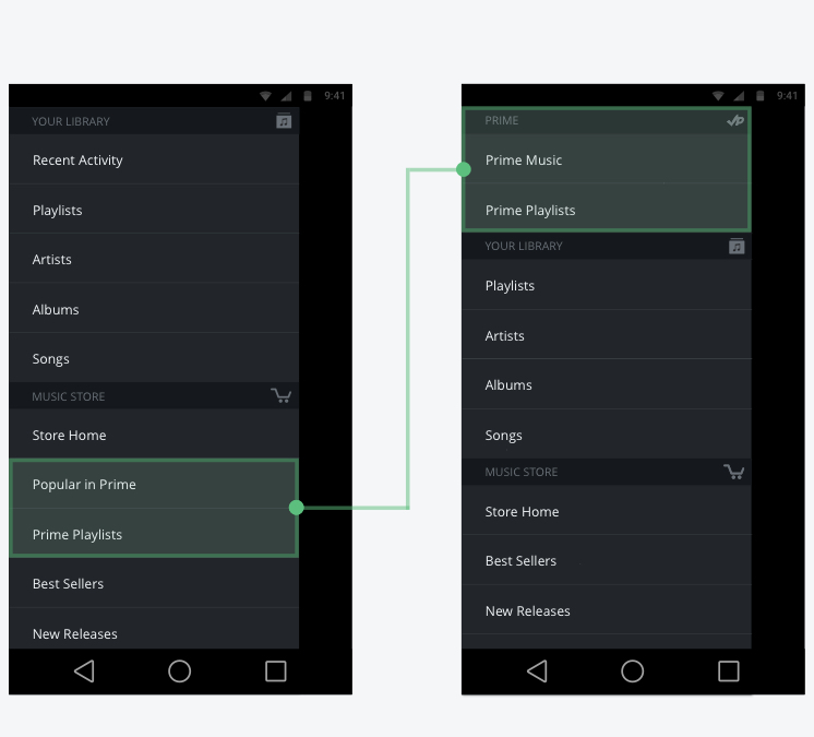
To solve the discoverability issue, we extracted the Prime Music sections from the store and positioned them as a standalone area in the top‐level navigation.
This tested well for discoverability, but created new issues as the navigation items were now essentially deep‐links. On the surface they appeared as a standalone destination, but in reality they were technically still part of the store.
After making this change, we observed that Customers often navigated away from the Prime section and into other areas of the store without understanding how or why.
This was a horrible bandaid solution that the team was divided on. In the end, we were willing to live with this experience for launch.
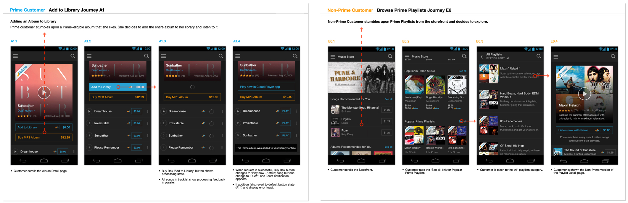
Playing and Collecting Music
We observed that although customers found value in the add to library feature, they also found it laborious and did not understand why they needed to.
“It is cumbersome to play selected music. When you click on “add to library” from initial Amazon music screen, a user would logically think he/she could play the music. Unfortunately, that is not the case.”
Our team was quick to jump to the perceivably easy solution to design a music playback feature in our Digital Music Store.
I fought against this proposal, based on the rationale that extending Amazon’s retail design patterns that are optimised for selling, would result in a cluttered, unfocussed experience for Prime and non‐Prime customers. Designing a playback feature in our Digital Music Store was short‐sighted and ignored a slew of other complexities related to playing, downloading and managing music.
Diving deeper into customer feedback, revealed that customers frustrations were not only about just wanting to play. Customers were also frustrated seeing purchasable non‐Prime‐eligible music. This signaled that the context of the Digital Music Store was creating extraneous cognitive load and not fostering the music experience customers wanted. Essentially, our designs were communicating buy, buy, buy, yet customers felt like they had already paid for their Prime membership and the music.
To offer the kind of pure music experience for customers, we needed a different strategy that was not grounded in dates and technological shortcuts. Creating this experience was scoped to take many many more months.
…And so we launched.
The Launch
Pulling The Trigger
On the evening of June 11, we began rolling‐out Prime Music to Kindle Fire, iOS, Android, PC, Mac and the Amazon Digital Music Store for mobile and desktop. The launch went off without a hitch—an amazing achievement considering the scale and complexity of the deployment.

The Evolution
A Not So Fast Follow
Whilst the hype from the launch was settling, we kept a close eye on our customer listening posts. We knew that there were big gaps in the product and needed to form a plan to prioritise fixes.
It was no surprise to the team that the post‐launch feedback mirrored the issues discovered during our usability and beta testing prior to the launch. I personally knew that there was no quick fix.
Fortunately, the pressure of the launch was behind us and we were able to carve out the space and time to do things right.
Strategy with Tactics
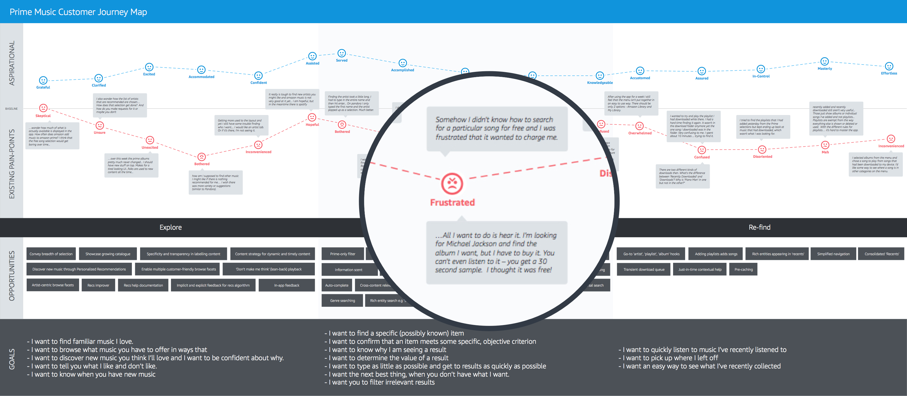
I spearheaded a research plan to gain deeper qualitative insight into the product pain‐points and to look for opportunities to evolve the product.
Over a two‐week period we ran a diary study and usability testing. We also used this time to test the viability of future concepts.
To disseminate the research learnings, I created a customer journey map.
This allowed me to communicate the severity of the pain‐points and facilitate conversations about the areas we wanted to fix.
“We had finally created the minimal desirable experience for our customers.”
The map highlighted how broken the Library‐Digital Music Store model was and created a deeper empathy amongst the team. This research was a major breakthrough for our team and allowed us to focus our energy on creating the right experience, this time.
After six months of design and development, we launched our first of many updates to Prime Music. Customers now have a Prime‐only area of the experience—completely optimised for Prime members and completely divorced from the Digital Music Store.
We had finally created the minimal desirable experience for our customers.
The Impact
A Good Start…And It’s Still Day One
It’s still early days for the service, yet the results have exceeded our expectations. Since the launch of the redesign of Prime Music on iOS and Android (April 2015), the median number of active customers has increased by 186%
Despite this rapid growth, we improved on key engagement, retention, adoption and acquisition metrics.
Increased median active days per customer by 50%
Increased median listening hours per customer by 36%
Increased new customer retention rate by 31%
“So many great songs. Think my Prime membership just paid for itself! Now I just have to get all my mobile devices loaded up!”
“I am so thrilled about Amazon Prime Music. This is a fantastic benefit of membership…now I can shop, read, and listen to music. It feels like Christmas—Thanks Amazon!!”
“This is totally awesome! Thanks so much for adding this to Prime! Great selection of music, couldn’t ask for more! I love it.”
“Prime Music makes my Prime membership so much better! Amazon’s big data team did a great job to understand my music taste.”
“That is fantastic!!!!!! Prime means more right now! I will recommend Amazon to my friends! Wow still cannot believe it is true!”
“I am so excited about Amazon Prime Music! I can’t wait to see what else Amazon comes up with! Well worth being a Prime member!”
“Great update. You have fixed my one gripe about the app. Now I can stream without adding to my library. Thanks for listening to your customers.”
“I love this app! It frees up storage space on my phone, but allows me access to TONS of free music choices since I am a Prime member.”
Reflections
What I Learned
Your Customers Won’t Forgive You
…because it was quicker and cheaper to build it *that* way
One of Amazon’s leadership principles is having a bias‐for‐action. Amazonians are proud to insist that product decisions are reversible and spending time doing is better than overanalysing.
Throughout this project, I observed how bias‐for‐action mutated into a bias‐for‐delivery. Our team disproportionately focused on measuring outputs, rather than learning and measuring outcomes. This inevitably led to a lot of waste, short‐sightedness and distraction for the team.
We let the question “how quickly can we build it?” define the it, more than we let our customers define it. We let the phrase “let’s just get something out there” define quality, more than we let our customer define quality.
If we had asked “are we building the right thing?” as much as we asked “are we going to meet our date?“, we would have launched a more reliable, intuitive and polished product, sooner.
Viability should have been defined by our customers way before the technology and date already did.
Launching Is Only The Beginning
I am often asked if I am proud of launching Prime Music. I’m partially lying when I say I am. Let me explain why.
I value simplicity, focus and utility. I aspire to make people happy by designing experiences that just get out of the way. Craftsmanship and carefully thought out details are important to me. I truly value music and care about helping people find music to complement the meaningful moments in their lives.
At the time of launch, I had difficulty accepting the reality of this product, because I knew where all the dead bodies were hidden. I knew the solutions to the myriad of usability issues. I knew which critical features were missing. I knew how much waste was incurred building non‐critical features and inevitably how the performance and reliability of what mattered most was compromised.
My dissatisfaction is not a case of perfectionism, but rather an insistence for quality. Quality that should never be compromised, even in the first version of a product. Quality is the responsibility of an entire organisation and I have learned that magical experiences are only possible if the whole team truly shares in the same values and aspirations.
Fast forward to the present, and I realise that my satisfaction and insistence for quality does not seem to matter at all. The success of this product had nothing to do with how I feel, but everything to do with if and how the product is being used.
So, if you ask me if I am I proud of what I launched I would still say no, but I would then tell you that I am very proud of what I accomplished for Amazon. I am proud that the team is in a better position to learn, and that launching this product needed to happen in order to expose how badly things were broken—both in the product and in the way we were working. I believe that great design takes time and wisdom, which is only possible if the entire team is in a position with an accompanying mindset to learn.
Today, millions of customers are enjoying Prime Music and we are exceeding our business objectives. And while I can’t prove how much the extra mile would have benefited our business, at least the product is not considered done.
Jeff Bezos’ famous saying at Amazon is that “it’s still day‐one”. For Prime Music, this could not be more true.